Quantcast
Channel: ink Archives - The Well-Appointed Desk
Viewing all 352 articles
Browse latest View live

Ink Drop: November 2013

$
0
0

Ink Drop: Nov 2013

I am so sorry I completely missed/forgot/skipped the Goulet Pens Ink Drop for November 2013. It was filled with colors that could be used for Christmas, unless, of course, you’re me and use green all year long. I also quite like reds so let’s call this my January Ink Drop and move on.

Ink Drop: Nov 2013

The inks included were Pilot Iroshizuku Shin-Ryoku which is a green with a blue undertone like a blue conifer. The Diamine Kelly Green is in my sweet spot: a green with yellowish undertones. And the De Atramentis Pine Green with is a deep green black. Maybe its the cold bleak weather but the Pine Green was my least favorite in this assortment.

In the reds is Diamine Crimson which is a wicked, vampish red and De Atramentis Poppy Red which is a brighter red with a slight orange undertone.

At some point, I’ll probably purchase bottle of the Shin-Ryoku as its such a unique green and the Crimson which would be perfect for Valentine’s Day or my first vampire novel.

All the writing samples were done with a dip flexible nib which are a bit more prone to bleeding then a fountain pen but so much easier to test and clean quickly.

Ink Drop: Nov 2013


Link Love: Puns and Paper

$
0
0
Link Love

(Ironic artwork)

Paper:

Pens and Ink:

Pencils:

Misc:


Link Love: The Good, The Bad & The Postal Rate Increase

$
0
0
Shades of Lime (via A Penchant For Paper)

Shades of Lime (via A Penchant For Paper)

Pens & Ink:

Pencils:

Paper:

US Postal Rate Increases (illustration by Donovan Beeson via Letter Writers Alliance)

US Postal Rate Increases (illustration by Donovan Beeson via Letter Writers Alliance)

Misc:


Ask The Desk: That’s not a pen!

$
0
0

Ask The Desk Header

I received an actual letter from Leah a week or so ago. She asked lots of different questions about pens and tools so I thought I’d include some of my answers here as well as in a letter to her.

She asked:

What pen/nib did you use for the titles of your 12 Days of Inkmas?

The secret is that I didn’t use a pen at all. I used a brush!

Screen Shot 2014-02-03 at 10.44.46 AM

I got the idea to use a brush from seeing some ink “swabs” on European Paper. They were using a brush to create a lovely little ink swab. I like that a brush was easy to clean and I wasn’t creating a landfill full of q-tips in sampling inks each month.

brushes21

I’ve used several different brushes that I’ve accumulated over the years to not only create “swabs” but also to create a more interesting header for the 12 Days of Inkmas. I’ve tried to keep up the habit for future ink samples and reviews as I can see the range of shading with the inks this way.

EDIT: The word “Wide Strokes” was done with the Scharff FINELINE 3000 #3, not the #6. Oops!

brushes22

From left to right: Robert Simmons #2 red Kolinsky hair and synthetic filaments round brush, A. Langnickel 670 #5 Red Sable script brush, Scharff Kolinsky red sable FINELINE 3000 #3 round and #6, and a Silverwhite synthetic 1500S #2 Round.

I’ve acquired brushes over the years from friends, yard sales and various art supply stores. I’m stunned to see how expensive the Scharff #6 brush is ($67)! I’ll definitely take better care of it. I’m confident that any good quality round brush recommended for watercolor, acrylic or oil would make a perfect tool for “swabs” and ink tests. Visit your local art supply or craft shop to pick up a couple.

Just remember to wash out your brushes in water, squeeze dry and reshape the tip to dry. Don’t scrub them and make the bristles flair out  or you risk breaking the fibers and/or hairs. Always dry your brushes with the tip up and don’t leave them sit indefinitely in your wash water or the bristles will bend at a weird angle. If you let them cake with inks or paints, try The Masters brush cleaner. It will save just about all your brushes!


Three Drops in One: April, May and June Ink Drops

$
0
0

For some reason, doing Ink Drop reviews seem to take forever. Maybe its because I have to dip and clean a pen five times. Then I get behind and have to dip and clean a pen TEN times. This time, I’m THREE months behind. So, hopefully, this was worth the wait.

Here’s the colors from the April, May and June Ink Drops:


April 2014: Islands in the Sun

May Ink Drop 2014 "Garden Party"

Blue skies, blue oceans, sunny days and sandy beaches are captured with the inks in the April Ink Drop. The R&K Helianthus was surprisingly usable for a yellow ink with more orange-y undertones. Private Reserve Shoreline gold was a warm orange-y brown. Both the Diamine Beau Blue and the Pilot Iroshizuku Ama-Iro are turquoise-y blues and the Diamine Coral is actually a blisteringly fluorescent pink-y orange. Its not so pinky as to be bubblegum, more of a vivid geranium blossom red/pink. This is a super fun assortment and was a perfect antidote to rainy, cold, snowy April. I love both shades of blue and will probably have to flip a coin to choose one or the other to buy as a full bottle. The Diamine Coral is also a favorite. It’s a bit more orange-y red than the Platinum Cyclamen Pink. J. Herbin’s Rose Cyclamen and Rose Tendresse are much more purple in comparison.

May Ink Drop 2014 "Garden Party"

May 2014: Garden Party

April 2014 Ink Drop "Islands in the Sun"

Garden Party lived up to its name with an array of reddish colors: DeAtramentis Apple Blossom (scented), Pilot Iroshizuku Tsutsuji and Pelikan Violet. The PI Tsutsuji is a tiny bit brighter, cleaner color than Pelikan Edelstein Turmaline. The DeAtramentis Apple Blossom is not overpoweringly scented but it has a fragrance in the bottle that is not noticeable when dry. The color is sort of mulberry reddish purple. Its actually a lovely color and probably my favorite in the bunch this month. Private Reserve Buttercup is super bright yellow but not a fluorescent. It has a hint of orange to it but not as orange-y as the R&K Heliathus from the April Ink Drop. Platinum Leaf Green is part of the mix-free line and is a truly kelly green — like a beautiful spring lawn. Not my lawn, but someone’s.

April 2014 Ink Drop "Islands in the Sun"


June 2014: Down to Earth

June 2014 Ink Drop "Down to Earth"

When the June Ink Drop arrived, I was a little bit of a doubter that the earthy tones of the Down to Earth theme would be appealing to me in the bright June sun but both of the browns were really appealing and the greens will be given a good deal more consideration than I initially thought. Private Reserve Ebony Brown is a deep clean brown on the reddish side of brown, warm like 70% cacao chocolate. It’s almost a warm brown black. If I were to buy a bottle of brown ink, this would be it.  And the Platinum Mix-Free Earth Brown is a warm orange-y brown that is richer than Pelikan Brown. Diamine Salamander is an olive-y green black. It reminds me of the color of American currency — like the green on a dollar bill — feels historical. Noodler’s Sequoia Green has a true evergreen vibe, like pine needles. The Pelikan Edelstein Aventurine is a bit deeper green than the Platinum Leaf Green from the May Ink Drop but still a vivid kelly green, just a touch deeper, darker green with a tiny bit of a bluish cast.

June 2014 Ink Drop "Down to Earth"

Ink Drop is a monthly ink sampling service from Goulet Pens. Subscriptions are $10 per month (add $5 for international subscription), pre-paid or ongoing, and include five different colors of ink and discounts on purchases of full bottles of ink in the Ink Drops.

Swabs are done with a watercolor paint brush on Kyokuto Word Cards, writing samples are done on Rhodia No. 18 Uni-Blank pad using a soft bristle watercolor paint brush and a Pilot Prera with a Pilot Plumix 1.1mm Medium Calligraphy Nib.


Review: Caran D’ache Chromatics INKredible Colors Delicate Green

$
0
0

Caran D'ache Chromatics Delicate Green Ink

Someone recently asked me if I had a recommendation for a really good green ink. That’s such a loaded question for me. Are you in search of a jewel-toned kelly green? A green-black? A green ever-so-slightly hinted with blue? Maybe something woodsy? There are just too many variations when it comes to green to pick just one and say “THIS is THE green”. Until now.

Caran D'ache Chromatics Delicate Green Ink writing sample

Caran D’ache Chromatics INKredible Colors Delicate Green is, for lack of a better description, officially my signature green. It is a bright, vivid green with just a hint of yellow to keep it citrus-y. I’m pretty sure Delicate Green matches my masthead and I wouldn’t describe it as delicate. Its punchy, cheery, “spring grass” green. I had to sniff it to make sure it didn’t smell like grass clippings (sadly, it doesn’t).

The only comparable shade I could find in my stash was Diamine Kelly Green ($12.95) or Pilot Iroshizuku Chiku-rin ($28). But the Kelly Green is obviously more kelly and the Chiku-rin leans more of a mustard seed yellow-green.

Often times, green inks in this yellow-green category are often a bit too light for everyday use and get relegated to “highlighter” inks or used just for play. But Delicate Green is bright and vivid enough to be legible and usable.

Caran D'ache Chromatics Delicate Green Ink

This is by no means a budget priced ink. But the inks come is a sturdy hexagonal box that hides the funky angle the bottle sits on when its removed. The bottle is a thick sturdy hexagonal glass with a solid silver metal cap. At $32 per bottle, the Caran D’ache Chromatics line is definitely a “special occasion” purchase but there are nice details in not just the ink but the packaging and presentation as well. Trust me, you’ll be glad you splurged.

To see more images of this ink in action, check out last weeks review for the Monteverde Intima.

Caran D'ache Chromatics Delicate Green Ink

DISCLAIMER: This item was sent to me free of charge by Goulet Pens for the purpose of review. Please see the About page for more details.

Ink Lightfastness, The Scientific Approach

July & August 2014 Ink Drop

$
0
0

Ink DRop Swatches

In an effort to get caught up on the Ink Drop subscriptions, I have done some quick swab swatches of the last two months worth.

July’s Ink Drop theme was an all-American Stars and Stripes so it was chock full of reds and blues which are also some of the most popular colors in inks so choosing just five samples must have been a challenge. The final selection was De Atramentis Atlantic Blue, Diamine Royal Blue, Diamine Presidential Blue, Diamine Poppy Red, and Sheaffer Skrip Red. Each bottle is $12.95 except the Sheaffer which is budget priced at $9.25. De Atramentis Atlantic Blue is a deep midnight blue. Diamine Poppy Red is a warm red, like farm tomatoes. Diamine Royal Blue is a bright vivid blue while the Presidential Blue is a bit darker and smokier but still a bright blue.

Since the August Ink Drop (“International Shipping”) also featured a couple shades of red and blue, it seemed like a good reason to show them altogether. The blues in the International Shipping set are much more vivid while the reds are deeper. The colors in the August set are: Private Reserve Naples Blue ($11), Diamine China Blue ($12.95), Montegrappa Bordeaux ($20), Noodler’s Mandalay Maroon ($12.50), and Noodler’s Burma Road Brown ($12.50). Mandalay Maroon is a dark, rich red while the Bordeaux takes after the wine for which is similarly named. My favorite of the lot was the Naples Blue which is a vivid ocean blue, the kind I imagine seeing from a bleached white Greek shore. The China Blue and previous Royal Blue are quite similar but the China Blue has more of a reddish cast. The final ink in the International Shipping set is the Burma Road Brown which is a cool green/brown. I’d be inclined to call it a green-black.

Ink Drop Swatches lined up

I still struggle a bit with the best way to swatch and sample my Ink Drop subscriptions. I tried using a dip nib, a glass pen, cotton swab swatches and painted swatches. No matter how I do it, there is a lot of clean-up and preparation. So, paint brush swabs for my swatch book are the fastest and at least give me an idea what the colors are for future sampling.

Swabs are done with a watercolor paint brush on Kyokuto Word Cards.


DISCLAIMER: This item was sent to me free of charge by Goulet Pens for the purpose of review. Please see the About page for more details.

Ink Drop is a monthly ink sampling service from Goulet Pens. Subscriptions are $10 per month (add $5 for international subscription), pre-paid or ongoing, and include five different colors of ink and discounts on purchases of full bottles of ink in the Ink Drops.


Review: Private Reserve Naples Blue Ink

$
0
0

Private Reserve Naples Blue Ink Review

I chose my favorite color, Private Reserve Naples Blue, from the August International Shipping Ink Drop collection and decided to go ahead and do a full review. I don’t normally go in for bright blues but this color looked like the bluest oceans. I couldn’t pull my eyes from the swatch so I had to take it out for a spin.

I tested it with my dueling Pilot Preras, one fitted with a Plumix Penmanship M Italic Stub and one with the standard M nib. I wanted to see if shading was visible in both. The shading range was so diverse in my painted title that I was hopeful to get as wide a range in the pens.

Private Reserve Naples Blue Ink Review

What I noticed is that the ink appears more like a royal blue in dark pools but as it thins out in linework, it becomes more turquoise blue instead. This showed in the shading with the stub italic nib making for some interesting emphasis. I like it. Its a beautiful color.

The ink is a bit drier than other inks so it dried fast which was nice on the slick Rhodia paper, especially with the wider nib. I didn’t have any issues with the ink being too dry with the M nib but a needlepoint nib might run into some drying issues.

Private Reserve Naples Blue Ink Review

In my head, I thought the Naples Blue reminded me of Pilot Iroshizuku Ku-Jaku but side-by-side you can see how much greener the Ku-Jaku is. The Naples Blue even gets a slight red/purple cast around the edges of the swab so they are quite different. In the fine writing sample though, the Naples Blue is a lot more turquoise so you can see the possible comparison.

Overall, if you’re looking to hold on to summer a little longer, want to dream of the bluest oceans or just need a vivid blue ink, try Private Reserve Naples Blue. Samples are $1.25 and a full bottle is $11.

Review: Mont Blanc Daniel DeFoe

$
0
0

Mont Blanc Daniel DeFoe Ink

I confess I did not recognize the name Daniel DeFoe when this bottle of Mont Blanc’s Writers Series Daniel DeFoe ink arrived. All I knew was that it was a shade of green. So I did what any self-respecting blogger would do, I looked up Daniel DeFoe on Wikipedia. Turns out he was the gent who wrote Robinson Crusoe as well as being trader, writer, journalist, pamphleteer, and spy. So, someone I’d like to have had drinks with at some point. Now that I’m past the history lesson, let’s move on to the ink review!

Mont Blanc Daniel DeFoe Ink

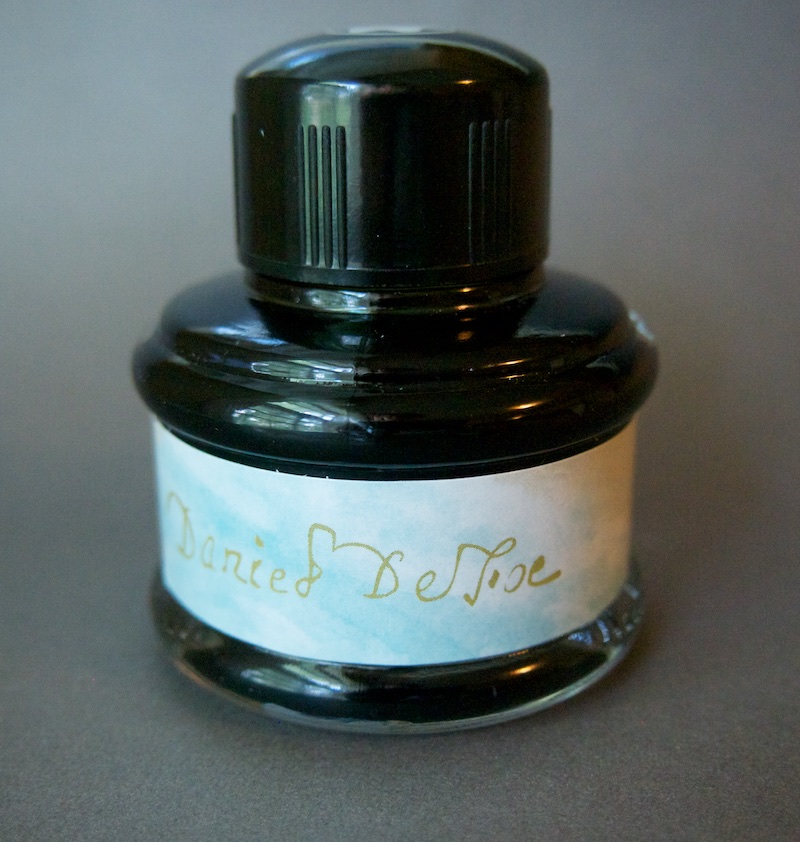
The bottle is a pleasing shape. Its classic plus it has Mont Blanc’s distintive logo mark on the cap. I think the label with the author’s signature printed to simulate the ink color is a little vague.

Mont Blanc Daniel DeFoe Ink

As I said before, not knowing who Daniel DeFoe was when the bottle arrived, I only loosely assumed the ink might be green. The vagueness of the packaging did not clear much up so it wasn’t until I dipped my paint brush into the bottle and started making lines that I had any kind of inkling what was to appear.

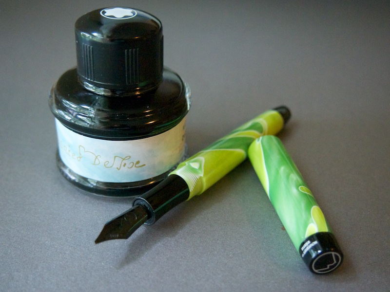
The color is a deep, woodsy, leafy green. It is supposed to be reminiscent of Crusoe’s island but it also reminds me of the color of military fatigue greens but a little more luminance. It’s dark and bold on the paper but with a brightness.

The more I look at the Defoe ink on paper, the more enamored I become.

Mont Blanc Daniel DeFoe Ink

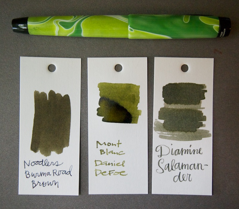
When looking for comparisons, I found Noodler’s Burma Road Brown and Diamine Salamander but they are both browner, muddier colors than the Daniel DeFoe.

I have to confess that I’ve seen Mont Blanc as a company that concerns itself with making beautiful, but veery expensive things that might not always be practical. This ink, however, is changing my thinking. Its an entirely usable color with good flow and consistency. In my wide 1.1mm nibbed Monteverde Intima pen on Rhodia paper, it took a bit longer to dry than some inks I’ve used lately but dry time was comparable to a lot of the Pilot Iroshizuku inks I’ve used.

Mont Blanc Daniel DeFoe is a limited edition ink available only for one year. A 35ml bottle sells for $19. I might have to order a spare.


DISCLAIMER: This item was sent to me free of charge by Pen Boutique for the purpose of review. Please see the About page for more details.

Mont Blanc Daniel DeFoe Ink

Review: Diamine Kelly Green Ink

$
0
0

Diamine Kelly Green

I’ve had this sample bottle of Diamine Kelly Green set aside on my desk for months with plans to be “my next ink review”. Since December. Well, here it is. Finally.

Diamine Kelly Green Ink Writing Sample

Diamine Kelly Green is a vivid, bright green with distinctly yellow undertones. For me, this means that in light strokes or fine nibbed pens, the color is in that “sweet spot” of lime, citrus-y green that I love so much. For someone else, it could mean a bright green that has gone decidedly off.

In my Noodler’s Ahab fountain pen with the flex nib, there was a lot of shading in the writing. Some might think too much shading as the top, lightest part of the strokes is a very light yellow-green while the down strokes are a clover green. It makes readability a bit iffy.

With a regular stiff nib, the ink is much lighter overall. More Kool-Aid Limeade green than a true Kelly green.

Diamine Kelly Green Ink Comparison

I quite like the color that results from using this ink with a fine or medium nib as it goes decidedly lime. However, if you are looking for a bold true green, this will not be the one for you.

Diamine Kelly Green is available by the bottle for $12.95 and samples are $1.25.


Review: DeAtramentis Apple Blossom Ink

$
0
0

DeAtramentis Apple Blossom

DeAtramentis Apple Blossom ($12.95 for a 35ml bottle) is sort of an “in between” color. Its not quite red, pink, burgundy or purple. I would best describe is as a smoky red violet. Its a scented ink, its a slightly sweet, powdery smell that is supposed to be reminiscent of apple blossoms. It was most noticeable when I was filling my pen from the bottle and less so in the pen or on paper. Once dry on the paper, it was unnoticeable.

DeAtramentis Apple Blossom

I tested this ink with my Pilot Prera which has become my go-to pen for ink samples because I can switch on the nib, mid-test and see the ink in a fine nib and a italic nib as well. With the italic stub, there was more evidence of shading but the color didn’t shift dramatically due to the wider nib.

I tried to find a similar color in my collection but I came up with a pinkier-pink (Edelstein Turmaline) and a deeper, more burgundy color (Montegrappa Bourdeaux). So, that makes me feel like the Apple Blossom really is a unique color and does remind me of those pinky centers on white apple blossoms. I like it in the same way that I like the old Noodler’s Black Swan in Australian Roses in that its a subtle, complex color.

Review: Pelikan Edelstein Ruby Cartridges

$
0
0

Pelikan Edelstein Ruby tin

I’d been very interested in getting some of the Pelikan Edelstein ink cartridges. They come in a lovely tin and I like having a pack of cartridges at work so that, in a pinch, I can quickly refill a pen without making a big mess.  The tin means I could keep it in my daily kit so I have cartridges handy all the time. I bought the Ruby color from my local pen shop.

Pelikan Edelstein Ruby cartridges

What I didn’t realize is that the Pelikan Edelstein cartridges are European LONG cartridges. Most of my pens, that take standard European cartridges, are not big enough for the long cartridges. I finally found one pen that could accommodate the longer cartridges, my Kaweco Student.

Pelikan Edelstein Ruby ink

Inked and ready to go, I was finally able to test PE Ruby. Its a pinky-red color with some nice shading, even with the extra-fine nib in my Kaweco Student. Its a bit lighter color than I had expected.  A Google image search for “ruby gem” reveals that rubies are a bit pinky in color when light shines through them so the name is appropriate for the color. Just, in my head, I always thought of rubies as a darker red.

Edelstein inks are good quality and flow smoothly and feel lubricated which helps validate the steeper price point.

Pelikan Edelstein Ruby ink writing samples

When compared to other reds in my stash, it does fill a gap. Diamine Wild Strawberry is a bit more orangey, and Noodler’s Mandalay Maroon is darker and probably more what my head thought of as “ruby”.

Six LONG European-style cartridges are available in each tin for $7.95 from Goulet Pens since my local pen shop does not list them on their online shop. If you’re in KC though, stop by The Pen Place in Crown Center and pick them up in person.

Ink Review: MontBlanc Meisterstück 90 Years Permanent Grey

$
0
0

Mont Blanc Meisterstuck 90 Years Permanent Grey

I was having one of those weeks at work where all I really wanted was a pick-me-up. So, at lunch one day, I ventured across the street to the Pen Place and bought a bottle of the MontBlanc Meisterstück 90 years Permanent Grey ($22 for a 60ml glass bottle). I bought it sight unseen (no test swab or anything), spurred entirely by how much I like the Daniel DeFoe ink and I wanted something new, different and special. I don’t know much about MontBlanc and their heritage but I was inspired by the moment, so I bought a bottle of this ink.

Mont Blanc Meisterstuck 90 Years Permanent Grey

The ink swabbed almost black so I was a little concerned that in writing, it would appear to be black. I was pleasantly surprised when I started writing with it that the ink is a watery grey-black with cool undertones (leaning a little green). Because of its lighter coloring, there is some nice shading when writing. I suspect in a finer nib pen, some of the shading might be lost. I definitely recommend using this ink with a medium nib or wider to get the full benefit of its color quality.

I don’t normally look for or purchase black inks. There are so many color options with fountain pen ink that I can’t bring myself to buy plain ol’ black. But I really like grey so I make an exception for grey inks. There aren’t a lot in my ink library so the Meisterstück Permanent Grey is an excellent addition. It is also a fairly water resistant color so it would make a good option for signing documents or addressing envelopes or anything else that might be exposed to the elements. When wet, there was a little grey washing around the writing but it stayed pretty true, enough to withstand getting caught int he rain or spilling some coffee.

This ink was tested on a Rhodia Uni-Blank No. 18 pad with my Lamy Studio with a 1.1mm stub nib.

Ink Review: J. Herbin Vert Réséda

$
0
0

J. Herbin Vert Réséda and Kaweco Skyline in Mint

Jet Pens recently started carrying the 10ml small bottles of J. Herbin ink and I’m absolutely mad for the little things. They are just the right size for my insatiable appetite for inks. I can fill pens several times with the quantity but it won’t stick aroud indefinitely like larger 30, 50 or bigger bottles. They remind me of bottles of nail polish — little colorful treats!

Sometimes an ink color was just meant to be paired with a pen. J. Herbin Vert Réséda is just such a color. Its a turquoise green-blue (not a blue-green) and it immediately made me think of the cool glacier mint color of the Kaweco Skyline in Mint. So, a pen/ink match was made. I bought the dainty 10ml bottle, slightly more than a sample but not the full commitment of a full 30ml bottle. I’m running out of place to store all my ink bottles anyway!

J. Herbin Vert Réséda

The color is a little bit lighter when wet then it is when its dry. So, at first, it seemed almost as light as the pen but it dries much darker and frankly, looks fantastic once dry. I did notice that in the fine nib of the Kaweco Skyline, the ink was a bit too light, even dry but when I dipped my vintage Parker Vacumatic with a slightly flexy 14K nib into the ink, I got a deeper color that I just loved.

The Vert Réséda is similar to De Atramentis Mint Turquoise but the Mint Turquoise is a bit more blue and darker. If you’re looking for a minty color that is good for finer nibbed pens, then I’d probably recommend the Min Turquoise over the Vert Réséda. Diamine Soft Mint swab is as light as the writing sample of the Vert Réséda with a fine nibbed pen so I suspect it would be too light for anything but a stub or calligraphy nib.

J. Herbin Vert Réséda

This is definitely an ink I’d recommend for nibs in the medium width and above for best results but if you’re looking for a light, bright turquoise green, it will even look pleasing in a finer nibbed pen.

($4.75 for the 10ml bottle, $12 for 30ml bottle)


DISCLAIMER: This item was sent to me free of charge by Jet Pens for the purpose of review. Please see the About page for more details.


Ink Review: Rouge Opera

$
0
0

J. Herbin Rouge Opera Ink Review

These little shooters of J. Herbin ink are just so addictive! This is the Rouge Opera ($4.75 for 10ml bottle) which came highly recommended by a friend as a “good red”. I paired it with my Kaweco Student with an EF nib. What’s black and chrome and red all over? (HA!)

J. Herbin Rouge Opera Ink Review Writing Sample

In the swab and the brush lettering, the red looked a little pinky but when writing its a good clean red. It doesn’t lean too pink or burgundy. Even with my EF nib, I got some shading which is nice.

The J. Herbin Rouge Opera Ink is also available in a larger 30ml bottle ($12) and tin of 6- European short cartridges ($5.50). Tested in Rhodia No 18 Uni Blank pad with a Kaweco Student EF.


DISCLAIMER: This item was sent to me free of charge by Jet Pens for the purpose of review. Please see the About page for more details.

Ink Review: J. Herbin Poussière de Lune

$
0
0

J. Herbin Poussière de Lune


If you’d told me five years ago that I would like purple inks, I would have scoffed. The older, wiser me nods agreeably. “Indeed, there are some purple inks I do quite like.” J. Herbin’s Poussière de Lune (Moon Dust Purple) is one such purple. This is another ink I purchased in the little 10ml shooter bottle ($4.75 each) which is just such fun. Any day now, I think I’ll own the whole spectrum of J. Herbin inks just because I can purchase them all in these little snack-sized bottles.

Poussière de Lune is an eggplant-y purple black. The photos show a bit more luminance and a touch more red than it appears in person.  When I first touched the ink to paper, I was immediately struck with the complexity of the color and it reminded me of the original formula of Noodler’s Black Swan in Australian Roses. When I compared the inks though, Poussière de Lune is actually closer in color to Rohrer & Klingner Scabiosa without the iron gall. This might be a plus for some people who want the color of Scabiosa but are worried about damaging their pens with an iron gall ink.

J. Herbin Poussière de Lune

The color does dry a flat, matte color but I think that’s to be expected with any inks that aren’t in the J. Herbin 1670 line with the metallic flakes in them.

Overall, I like the performance of J. Herbin inks. They are wet enough for my fine nib pens and have a good amount of shading. Poussière de Lune is no exception and may actually be one of my favorite J. Herbin inks thus far.


DISCLAIMER: This item was sent to me free of charge by Jet Pens for the purpose of review. Please see the About page for more details.

Diamine 150th Anniversary Ink Collection

$
0
0

Diamine 150 years ink

In honor of the 150th anniversary of Diamine, eight new ink colors have been announced. The 1864 “Anniversary Collection” features new, triangular-shaped 40ml bottles. All the inks will be available for individual purchase and this collection will not be a limited release. For a full listing of the colors and written samples, check out this post from The Good Captain on the FPGeeks forum. I’m particularly keen on the Regency Blue, Blue-Black, Safari and Silver Fox.

Hopefully theses inks will start shipping in time for holiday stocking stuffing.

Diamine 150th Anniversary Ink Bottles

(via FP Geeks)

Ink Review: Kaweco Palm Green

$
0
0

Kaweco Palm Green ink

Kaweco Palm Green is a vivid, “true green” ink. What is really unique about this green is that it has a reddish halo around the edges of the letters as the ink dries. This effect might not appeal to everyone but I think it gives this color a lot of dimension and interesting shading. The shading is more noticeable on the swab (that’s not a camera halo!) pictured below.

Kaweco Palm Green ink comparison

When compared with some of the other green inks in my stash, it definitely fills a gap. Palm Green is darker green than the Private Reserve Spearmint and more true green than the Pelikan Edelstein Aventurine. While the Diamine Ultra Green and PR Spearmint seem similar to the Kaweco Palm Green, they do not have the wonderful red halo.

I’m quite pleased with the color of the Kaweco Palm Green and look forward to using it regularly.


DISCLAIMER: This item was sent to me free of charge by Kaweco for the purpose of review. Please see the About page for more details.

Review: Maruman Word Cards

$
0
0

Maruman Word Cards

It took me almost a year to fill up my first Word Cards ring with ink swatches. It was a Kyokuto brand Word Cards ring I purchased in San Francisco from Maido for about $3. I liked the Kyokuto cards well enough that I wanted to buy a new ring but could not find them available online anywhere. As a result, I decided to try out the Maruman Word Cards. The Maruman cards are a little larger than 4″x2″ so they are visibly larger in size than the Kyokuto cards and a bit pricier ($4.45) for 100 cards. They do have pleasing rounded corners and a toothier stock so the increase in price does not seem wholly unreasonable.

Word Cards

Maruman Word Cards

At first, I was worried that the Maruman cards were not going to be white enough to give a clear representation of the ink colors but it turned out not to be the case. The Maruman cards are a touch softer white than the Kyokuto cards but not so much as to alter the ink colors.

Maruman Word Cards comparison

The tooth of the paper definitely gives the ink someplace to settle into and potentially show off any tonal variations in the inks which I quite like. The larger sized cards give me more room for both swabs and potentially a little writing sample when the inks get filled into pens.

And the biggest plus for the Maruman Word Cards is that they have continued to be available on JetPens for several years so I should not have to change or upgrade my ink cataloging system again anytime soon.

Viewing all 352 articles
Browse latest View live