Following discussions and suggestions from friends and followers of the blog, we are introducing two new rubber stamps in the shop this week. This post falls clearly in the category of shameless self-promotion so proceed forewarned.
The stamp is available mounted on wood as an “art block” (no handle) or with a blonde wood handle.
The stamp is thick red rubber, mounted on cushion foam and the design is laser etched on the top to make it easy to identify.
The second design is a tall faceted bottle stamp ($14) based on a vintage bottle design. It is 1.25″ x 2″.
It is also available as the “art block” (no handle) or with a blonde wood handle and laser etched on the top with the design.
The stamp features the same high quality as the short ink bottle stamp.
We recommend using a waterproof, archival stamp pad if you want to swab your ink samples over the stamp. Below we have demonstrated tests using the Avery Carter’s Stamp Pad, Office Depot Stamp Pad and Ranger Archival Stamp Pad. The Avery Carter’s and Office Depot came from Office Depot. Similar big box office supply store stamp pads should work as well. Look for a pad that says “dye-based” not “pigment-based”. The Ranger Archival pad came from JoAnn’s hobby store. Again, any stamp pad listed as archival, waterproof or dye-based should work.
The sample above shows the three black stamp pads used in a Nanami Cafe Tomoe River Notebook. The Ranger pad seems darkest but all three pads have been in my possession for sometime and the quality may be a result of age.
Above, the same three stamp pads are used in a Col-o-ring Oversize. Again, the darkness of the ink from the pads may be a result of how old the pads are though my inclination is to guess that the Ranger pad may be of slightly higher quality as it’s designed for craft purposes.
Don’t think you have to limit yourself just to black stamp pads. There are lots of different color options in the Archival stamp pads and it could make for some really fun looks in your Col-o-ring Ink Testing Book or other notebook. Here, I used a Ranger Archival green stamp pad with Vinta Sirena green ink. I think it looks pretty cool.
I tried a similar technique with an Avery Carter’s red stamp pad and Ferris Wheel Press Lady Rose ink and I got a little bleeding of the red ink. It could be a reaction between the ink from the stamp pad and the fountain pen ink or that the stamp pad ink is not as waterproof as the black ink. I’ll have to test it further to find out. I still think it looks pretty.
Finally, back to using a black stamp pad and Colorverse Crystal Planet. I left the label open to maybe write the color name in once the ink is dry. So many options!
I hope you are as excited about these new stamps as we are. If these stamps are well-received, we may introduce more ink bottle shapes. What do you think? Do you like them?
After my Ask The Desk post about sheening inks, I’ve had many questions about how to make ink ring swatches. I first saw these in a lot of the swatches from Asian pen enthusiasts and I wracked my brain trying to figure out how they did it. I made a mess of many pages of my notebooks while I worked it out. It’s actually really easy to do.
Most ink bottles develop a bit of ink on the lip of the bottle once they’ve been opened. By pressing this ring of ink on paper, you can get a quick sample of the color without having a cotton swab or paint brush handy. This can be done on a Col-o-ring or Col-o-dex card or right into your notebook.
For this demo, I used my Col-o-ring OVERSIZE and pressed it down on the top of a bottle of Sailor Jentle Yamadori.
The ring looked like this. Then with a dip pen or another pen, I can add the name and color of the ink to inventory it.
In this case, I used a vintage Mabie Todd dip pen. Voila!
In a notebook, the same page can be used to swatch several inks in an interesting layout.
Here is another bottle. This time, a small Monteverde California Teal bottle. Can you see the ink on the lip of the bottle?
I flipped the paper and tapped it on to the bottle. If you are trying this for the first time, it may be easier to do with a Col-o-ring card or some index cards since it will be easier to aim and get your process down before trying it with a 300+ page Tomoe River notebook.
So, here’s the results of my page with two inks sampled. Let’s keep going.
The next bottle is Pen BBS No. 224. There’s some ink around the lip. If, for some reason, you have a bottle without any ink around the lip. Put the lid back on and screw it down, then unscrew it a half turn and turn it upside down. I recommend doing it over your sink, just in case it leaks at all. Then turn it right side and unscrew it and see if there’s some ink on the lip. If not, try the half turn/upside down trick again.
With two rings on my page already, I needed to look carefully to aim my ring artistically.
It turned out okay.
The only true challenge is sample vials. Ink does not accumulate on the lip of plastic, sample vials like it does on glass vials.
The only way to get a good amount of ink on to the paper is to tip the vial on to the paper which can be messy if the vial is not in contact with the paper entirely and leaks. So…. did I cover everything?
Oh-emm-gee! Let’s get this out of the way right now. I could not get this list down to ten. Not. Even. Close. And it is not complete at all. Get your comments ready right now because I’m sure I left your favorite color out.
What I attempted to do here was provide a “best option” (consider those air quotes) for the ROYGBIV colors plus a brown, grey, black and blue-black. So — it’s about eleven colors. I left out any inks that are specialty inks that have glitter sparkles or are super-sheeners or those specialty color-shifting colors like Sailor 123. I wanted to provide a basics palette here based on the experiences of five years of helping sell inks at pen shows and these are colors I recommend over and over again as well as colors I personally reach for over and over again.
I also tried to provide a lower priced option or a more-easily available option if my first choice is a pricier ink. Hence, the dozens of swatches in the photos. So, shall we?
Pink: Lamy Vibrant Pink ($8 for 50ml)/Crystal Rhodonite ($16 for 30ml) (It’s the same ink, just repackaged) Okay, well, I already broke my own rule about no ink with sparkle since Lamy Vibrant Pink has sparkle in it but it’s a good solid pink whether you shake it up and use the sparkle that settles to the bottom or not. Once Vibrant Pink is sold out, Rhodonite is the same color but considerably more expensive. Callifolio Andrinople ($13 for 40ml) is my go-to pink. It’s pink without being too pink. Taccia Momo Pink ($13 for 40ml) is the eye-searing pink when you need to make a pink statement. It’s a great ink at a great price.
Red: Diamine Matador ($7.50 for 30ml) This is a good red-red. The price is extremely reasonable and Diamine ink is very well-behaved. Everyone has their favorite shade of red but I tend to recommend this as a good place to start. Sailor Jentle Irori ($15 for 20ml) is my favorite red and THE INK I used when testing paper leading up to the stock we use for the Col-o-ring. It has a gold sheen that shows on certain papers like the Col-o-ring on the edges of letterforms or big swashes of ink. It’s a little more orange-y than Matador.
Orange: Sailor Jentle Apricot ($25 for 50ml) is my go-to orange. It’s the happiest orange and Sailor’s inks are really well-behaving. The bottle is a little annoying for larger nibs but if you can transfer the ink to a taller bottle or syringe fill your pens, it’s not a big deal. My less expensive option is Papier Plume Sazerac ($10 for 50ml). Sazerac is a little bit darker, smokier orange but I am not complaining. More inks need to be named after cocktails, don’t you agree?
Yellow: I’m not sure it really qualifies as yellow but overall yellow inks are not terribly usable on a daily basis so I am using this slot to recommend Callifolio Huere Dorée ($13 for 40ml). Yes, there is KWZ Honey and Franklin-Christoph Honeycomb and Robert Oster Honeybee but Huere Dorée is an unsung beauty and deserves to be recognized. In general, Callifolio is a brand that doesn’t get nearly the attention it deserves but that’s a topic for another day.
Brown: I am going to slot my pick for brown here next to yellow for lack of a better place to put it. My pick here is Robert Oster Caffe Crema ($17 for 50ml). I don’t tend to pick brown inks very often but when I do, its either Caffe Crema or Melon Tea. People wax poetic about Robert Oster’s blues but when he creates colors outside of his comfort zone, he often makes some really amazing colors. These two browns often prove my point. If you need more options, check out our post about Sepia.
Green: I lean towards greens that are a little more yellow green or olive-y than grass green so my apologies here for my green-bias. I chose Pen BBS #342 Matcha Green Tea ($16 for 60ml) or Sailor Waka-Uguisa ($14.99 for 20ml) which matches a great number of my pens. Both inks perform really well. I really like Pen BBS inks and they are a great value.
Teal: Monteverde California Teal ($9 for 30ml bottle) is an ink I basically just stick into people’s hands when I see them at pen shows and they look bewildered by the many choices available to them. If they don’t have any inks or only have black and blue ink, I recommend this ink. It will open the world of colors to them. Yes, its a sheen-y color but not too sheen-y. It’s not crazy expensive and it’s not an enormous bottle. The color isn’t too garish to put off someone who’s worried that it won’t be “work appropriate” and it’s funky enough to win over someone looking for something “a little different”. If you don’t have a bottle of California Teal yet, you need one.
Turquoise: When people ask me for a great turquoise, the words jump out of my mouth so fast they often do a double take: Robert Oster Torquay. “Not Fire & Ice?” “Nope. Trust me.” So far no one has come back and hit me with the 50ml plastic bottle so hopefully they’ve been happy with the ink. It reminds me of the color of swimming pools when you write with it. Let me know if you agree. My other recommendation is slightly darker, it’s Pilot Iroshizuku Ku-Jaku ($22.50 for 50ml) and it’s one of my most-reached-for inks. For me, it’s my neutral. It’s bright but not too bright. It’s turquoise but not garish. It’s totally readable and becuase it’s Pilot, it’s a high performance ink in any pen.
Blue: Waterman Inspired Blue ($11.30 for 50ml) (my bottle was rename Obsession Blue for some weird reason, don’t ask… it’s the same color) is one of my favorite blues. I like to blow people’s minds by telling them this. I also like to show them how it sheens too. It’s safe for vintage fountain pens, it’s inexpensive and it’s fairly readily available. Have a bottle handy at all times. If blue isn’t your thing, Waterman also has a great purple. Pilot Iroshizuku Kon-Peki ($22.50 for 50ml) is another great blue option and is a fan favorite. It’s a lubricated ink designed for Japanese fine nibs and comes in a pretty bottle.
Violet: I have only one favorite violet and it’s Sailor Jentle Fuji-Musume ($12 for 20ml). There are others that I like but they are darker, dingier violets or they are more red-purples. This is a true violet and a gorgeous ink with good ink characteristics.
Blue-Black: My favorite blue-black is Bungbox 4B (¥3500 for 30ml, directly from Bungbox in Japan) but it is difficult to get in the US right now. I assume it’s a result of our current shipping issues and that it should be available through Vanness, Pen Chalet and Goldspot in a few months. Bungbox is a small Japanese pen shop that gets custom made Sailor ink for it’s shop. So, it’s extremely good quality ink and colors that are chosen under the watchful eye of pen enthusiasts like us. Of course, Bungbox ink is also pretty expensive too. So, my second recommendation is Taccia Aogura ($12 for 40ml) which is also a beautiful Japanese ink but is considerably less expensive and much easier to access. It’s a little darker but it’s still a beautiful ink. Another option is Kaweco Midnight Blue ($14 for 30ml). It’s another great blue-black that’s reasonably priced. It’s a little brighter but still perfect for the office or other professional setting.
I have one more option for you. I know, I already gave you three options but you have to understand, after the blue/turquoise and teal category, blue-black is probably the most popular color category. So, here is my other recommendation: Diamine Denim ($7.50 for 30ml). It’s my casual Friday blue-black. You’re welcome.
Grey: With grey inks, there are warm greys and cool greys and sometimes neutral greys. I tried to find one of each but you can decide how close I got. Montblanc Oyster Grey ($24 for 60ml) is as close as I could find to a neutral grey. It’s probably a little more on the cooler side with a hint of blue and a little golden sheen but it’s pretty grey-grey. This is part of MontBlanc’s standard line-up so it’s pretty reasonably priced. Lamy Crystal Agate ($16 for 30ml) is a green grey with a bit of sheen. It’s really quite lovely and is my current favorite grey. Diamine Earl Grey ($7.50 for 30ml) is a warmer grey with more red making it almost a purple-grey.
Black: Everyone needs a bottle of black ink. Once we discover the great spectrum of color, it’s hard to buy a simple bottle of black ink but there’s always a place for simplicity. If you have vintage fountain pens, you can’t go wrong with a bottle Waterman Intense Black ($11.30 for 50ml) which will be safe for your vintage pens as well as all your modern pens as well. If you only have modern pens, Monteverde Raven Noir ($9 for 30ml) will be an excellent option.
Bonus Waterproof Black: I consider Platinum Carbon Black ($22.50 for 60ml) a must-have ink for anyone who likes to draw, paint or do any kind of arty pursuits with their fountain pens. I have put this ink through some pretty lengthy tests to see how safe it is for pens and how waterproof it is and it has performed admirably over several years of abuse. I have sacrificed a Lamy Safari to a let-the-ink-dry-in-the-pen test and it washed out with nothing but water. A longer dry test could probably clean out with a sonic cleaner without breaking a sweat. Sailor Nano Black was mentioned as an alternative but studies by other artists have indicated that Nano Black is not as waterproof throughout the life of a bottle of the ink as Carbon Black.
DISCLAIMER: Some of the items mentioned in this post were provided free of charge by our sponsors for the purpose of review. Please see the About page for more details.
Ink is a passion of mine, a passion that rose to a ridiculous level a long time ago. It started out with a small selection of four or five ink samples and has grown into a collection of nearly 2000 ink samples, bottles, vials, swatches… While I completely understand I cannot use up all of this ink, it has become an obsession with color, shading, sheen, sparkle, ink properties, and un-obtainability.
However, one ink line is noticeably missing from this collection. KWZ inks. The reason behind this has always been the smell.
Ink preservatives lend a distinct smell to ink – just open up a bottle of Sailor ink and sniff. To combat this smell, KWZ adds something or other to the ink that partially masks it and has a pleasant vanilla-like perfume.
It just happens that I have unfortunate memories associated with the smell of vanilla. Many years ago there was a terrible incident with a large amount of vanilla-scented oil being spilled on carpet. I had to smell that for months. I shudder at the thought of those months.
While I love the colors offered by KWZ, I’ve never been able to get over that scent. But I was very pleasantly surprised when I opened up the newest offering from KWZ, Discovery Green, a Dromgoole’s Exclusive color. The vanilla scent in this ink was barely noticeable! Instead, the smell was quite neutral.
I do enjoy sheening inks, but those that cover up the color of the underlying ink are a bit too much. I was expecting a super sheening ink with Discovery Green but was again surprised to find a slightly subdued sheen that looks almost matte metallic and is only obvious at certain angles.
See? Here’s the same card in the same light at two different angles:
The sheen on this ink is beautiful, but not as overwhelming as many I have seen.
I was able to get a good comparison of the underlying color by keeping the Col-o-ring cards at a certain angle – Lamy Crystal Peridot is very close although Discovery Green has a touch more green. Very similar in writing to Robert Oster Peppermint but with more sheen.
I found Discovery Green to be dry in writing, an experience that is common to most highly sheening inks. In the photo below, you can see there was a bit of smearing in the “n” in Green, but I had not yet given the ink time to dry. I did not have a problem with smearing once it was dry.
Dry time was longer with this ink – also common with sheening inks on Tomoe River paper – the ink was dry in 30 to 35 seconds in normal writing but much longer in pools or swatches.
As I said, Discovery Green is a dry ink. I had no problems with it when I first inked up my pen. There were also no problems after letting the pen sit for a week without writing. However, the next week (2 weeks in the pen), I had a difficult time getting the pen to start – I had to wet the nib in a cup of water and also prime the feed before the pen was happy. I would say if you are going to write a pen dry, the experience will be wonderful.
I do love the color of Discovery Green. According to the Dromgoole’s site, “The name comes from the beloved Discovery Green park in downtown Houston, which is filled with interesting sculptures, fun play areas, and grassy hillocks. Perfect for a picnic or throwing a frisbee with your friends. Take a leisurely stroll with all of us at Dromgoole’s through KWZ’s Discovery Green”
I loved the changes in shading between a dark teal and a medium forest green. I also enjoy the more livable level of sheen.
I now have a rule though. Don’t color in block letters with a fine nib.
DISCLAIMER: The ink in this review was provided free of charge by Dromgoole’s for the purposes of this review. All other items in this review were purchased by me. Except for the Col-o-ring which was provided to me by a wonderful person who pays me to write blogs by keeping me supplied with Col-o-rings. Please see the About page for more details.
There seems to be a time in the middle of summer each year when the new inks just aren’t coming out as quickly. Spring announcements have passed and we aren’t yet starting into the holiday selling. Plus, with no pen shows going on at the moment, I’ve tried to look for ways to enjoy my current inks even more.
Color is endlessly fascinating to me. I also love taking things apart to see how they work (as a kid I rarely put them back together, though) and combining these two things is even better.
Enter, chromatography. Before I start down this path, though, let me issue a warning: I am no expert at this in any way. I have a method here that works for me and explanations that may or may not be fully correct. I’ve made lots of mistakes but hope is that you learn something here and find another way in which you can enjoy your inks!
There are so many ways to explore the colors that make up each ink – I can’t talk about all of them today, but I will share a couple of methods. The photo above is of chromatography strips. I purchased a small package of them from Amazon a while back – as far as I can tell, they don’t lose their chroma magic over time.
Chromatography paper is incredibly absorbent, thinner than blotter paper, and a bit rough to the touch. Because it is so absorbent, it wicks up water easily. With ink chromatography, a small amount of ink is applied to the paper, one end is placed in water, and as the water works its way up the paper, the various colors of the ink are revealed.
This is all possible because ink is water based and made up of various components that have different solubility and/or densities. the water carries the color components up the paper different distances.
These photos show some of my first attempts at chromatography from several years ago. My methods have changed slightly since then, hopefully for the better!
In the chromatography strips method, you will only need a few supplies:
Chromatography strips
A container for water
A way to suspend the strip in the water
Ink
I have seen plenty of methods of suspension used. Some include using a rubber band and a skewer or paintbrush. I enjoy using a clip of some sort (paper clip, binder clip) that is wider than the opening of my container.
I use clips because they are easy to find in my desk and usually require less fiddling on my part.
What are the requirements with this suspension? The bottom of the strip should not touch the bottom or sides of your container
One big tip here: measure this BEFORE putting the strip into the water.
Speaking of water, what kind should you use? I only use high grade super quality distilled water. Just kidding. I’ve never had a problem using plain tap water with this method – we are not aiming for highly scientific results. If you live in an area with lots of minerals in your tap water, it is probably worth using bottled water or distilled water if you have it. I happened to be in a situation where distilled water was at my desk within reach.
Add a small amount of water to the bottom of the container. Make sure to measure that your strip will be in the water, but only the bottom 1 cm or so (less than half an inch).
Now, for the ink! I used Franklin-Christoph Honeycomb and Troublemaker Inks Milky Ocean in this post – you can use this with any ink you own. In the above photo I used a glass dip nib to apply a thin strip from edge to edge, about 3-4 cm (a little over an inch) from the bottom. Don’t apply a huge amount of ink – just draw a single line slowly across the paper. The paper will soak up plenty of ink as you do this.
Check to make sure this line of ink will be above the water level when the strip is placed in your container. This is important unless you want inky water.
Suspend the strip in the container and watch!
The pigments will start to travel up the paper at varying speeds. Sometimes the color combinations can be quite surprising.
But when should you take it out? When is it done? I’ve experimented a bit with time, but the best way to judge this (in my opinion) is just when the color stops moving up the strip. Or the water makes it all the way up to the top of the strip. I’ve seen it take anywhere from one minute to five minutes. For the purposes of this activity, I would suggest about 2-3 minutes.
The paperclip and tiny ink bottle are another favorite of mine. The ink and water can move past the paperclip easily and the setup doesn’t take up much space. Remember: don’t let the strip touch the bottom or sides of the container and make sure the water level hits the strip below the application of ink.
I’ve also enjoyed watching ink spread out on paper towels as I am filling or cleaning pens. I’ve heard many times that this is a good alternative to chromatography strips, so I’ve included results from that as well with the same inks. I applied a healthy drop of each ink to the paper towel then drops of water to the middle of the ink spot. I added a drop at a time until the ink stopped moving out. The texture and brand matter tremendously with this method – I used very absorbent paper towels that feel a bit like cotton cloth.
Milky Ocean is the ink used on the right and Honeycomb is the ink on the left. Paper towels are a good alternative if you can’t get ahold of chromatography strips, although the results aren’t identical.
After everything has dried, I label each strip with the name of the ink and keep them clipped together at my desk. They are fun to flip through as I’m trying to choose an ink for a new pen or just to inspire me to experiment more with ink!
Paper: Chromatography strips ( $7.49 on Amazon – this is an affiliate link)
DISCLAIMER: Some of the items included in this review were provided to us free of charge for the purpose of review. Please see the About page for more details.
Colorverse recently released a line of tiny inks called The Mini Collection. Nearly all of the colors in the line have been previously released in their regular seasons. However, some of the colors were only accessible as part of a traditional Colorverse ink set which includes one 65mL bottle and one 15mL bottle. Where as before you may have had to shell out $36 for the set when you were really only after the smaller 15mL bottle, these mini inks allow selecting and testing specific inks without investing in a full set or a massive 65mL bottle. The packaging may be small, but it still manages to include the whimsical attention to detail of their previous releases.
The mini collection is sold in sets of three inks, and one of the most interesting aspects of the line is that you are able to individually self-select any of the inks from the collection as the three inks you would like included in your set. This type of set-up is a welcome addition in a world of ink where most sets allow little choice and often leave you with some inks you prefer more than others.
Colorverse already produced one of the smallest glass ink bottles on the market with their 15mL line. It’s important to note that these mini sets do not include the 15mL bottles, but instead include even smaller 5mL bottles. One the the more precarious parts of using tiny ink bottles is the size of the opening of the bottle. The Colorverse 15mL bottles were already tiny openings, and these mini bottles are every smaller. The good news is that I checked several different converters, and they all fit fine into the bottle for filling. You would not be able to fit a nib or a pen into the bottle to do a piston-fill. Amazingly, with a bit of rolling and finagling, I was still able to successfully dip the Col-o-ring Dipperinto the bottles. Hooray! The bottles come with a plastic pipette for filling. The pipette works, but I found a syringe easier to use.
Price is definitely something to consider with these inks. At $19.50 for a set of three, the price per mL nearly triples compared to the original Colorverse sets. It’s also about double the cost of purchasing three ink samples, and the size is only 1mL greater than a traditional sample. On the other hand, you get the benefit of adorable tiny glass ink bottles and miniaturized packaging. It is also worth noting that other than samples, this is the only way I know to try three different ink colors of your choosing for under $20. If you are trying to fills holes in your Colorverse collection without breaking the bank, or just want a chance to try a variety of inks at a lower cost entry point than other Colorverse sets, these inks are perfect for that scenario.
All of seasons 1-5 are available in the collection as well as six colors from the Earth Edition, four Special Edition colors, and three colors from a brand new limited set. Thanks to Ana gifting me many of her Colorverse duplicate 15mL bottles, and purchasing a few new mini sets and some additional samples from Vanness, I was able to swatch all of seasons 1-4 along with one of the special edition inks and the three new limited colors.
Along with the launch of the mini collection, Colorverse also released a new limited set of three colors: the Johannes Kepler Set. The namesake of the set was a scientist and astronomer who is known for everything from describing the orbit of planets to writing what many consider to be one of the first pieces of science fiction.
The inks are packaged in the exact same manner as the other mini collection sets, but are sold as a pre-selected set. The set includes a red, green, and blue. None of the inks have significant sheen, but all are decently saturated inks that show some shading properties. I compared the colors to some of the other reds, greens, and blues from the Mini Collection.
Overall, I don’t feel the colors in the limited set are the most interesting in the Colorverse line overall, but I do enjoy all three of the included colors enough to merit having them in my collection. The small 5mL bottles give me the perfect opportunity to swatch all three, and still have plenty of ink left over to fill a few cartridge/ converter pens.
Swatching all of seasons 1-4 reminded me how many great colors Colorverse has released over time. The Mini Collection makes me hope to see more ink manufacturers innovate their methods of releasing ink- especially in terms of allowing more individual selections in the purchasing of sets. I would also like to see Colorverse release similar sets in the 15mL bottle size. One can dream right?
DISCLAIMER: The items in this review were purchased with my own finds or handed down to me from the Colorverse queen. Some of the inks that were passed on to me were originally provided to us free of charge for the purpose of review. Please see the About page for more details.
Last December I was a little overwhelmed. Between work, the holidays and life, getting time to actually enjoy the Diamine Inkvent Calendar didn’t happen. I was able to open about half of the calendar before time got away from me. I wanted to enjoy the experience of opening each window and the inks so, on the advice of Jesi, I saved the calendar. Then the pandemic came along and this summer became the perfect opportunity to take time to open and enjoy these inks. This also coincided with Diamine releasing full-sized bottles of the colors originally included in the Inkvent calendar called the Diamine Blue Edition Collection ($15 per bottle) in new, whimsical shaped 50ml bottles.
The original Inkvent Calendar was a paperboard package that featured classic perforated windows. Under each numbered window there was one of twenty-four 7ml glass vials and on the 25th, they included a large 30ml bottle.
Each bottle indicates the color as well as whether the ink is sheen, shimmer, standard or a combination of these characteristics. The new Blue Edition Collection lists the inks with the same notations.
Per the listings, the inks are as follows:
Standard
Elf
Purple Bow
Gingerbread
Fire Ember
Mistletoe
Mulled Wine
Ho ho ho
Nutcracker
Triple Chocolate
Poinsettia
Candy Cane
Roasted Chestnut
Sheen
Midnight Hour
Festive Cheer
Holly
Polar Glow
Noel
Season’s Greetings
Shimmer
Solstice
Blue Peppermint
Gold Star
Snow Storm
Shimmer & Sheen
Winter Miracle
Jack Frost
Happy Holidays
This video will give you a day-by-day swatch preview of each color from day one to day twenty-five. There’s no audio for this video, it’s just a flip through.
I’ve also grouped each of the swatches by color. I’ll start with the reds. The set included six reds. It’s a holiday set and red is a predominate color for the holidays. There are three bright reds and three darker reds. Candy Cane is a little more pinky-red/cooler red. Ho Ho Ho is very Santa suit red. Fire Embers is a warm red-orange. Surprisingly, none of the reds were shimmers. The only sheener was Noel and it was almost a wine color.
I think the holidays is one time where it is entirely acceptable to have a shimmer ink for addressing holiday cards or packages. I think including a shimmery red ink would be totally appropriate in the Inkvent calendar and was a missed opportunity. For 2020, shimmery red with silver particles is my recommendation.
I found Poinsettia to be very watery. It bled on my swatch cards and that seldom happens. I noticed that it happened on the Vanness swatches too so it’s clearly the ink and not my nib.
There were five blue shades in the calendar. They are lovely colors but five is a lot of blues especially considering that blue is a common color in most ink collections. With a small sample size like the Inkvent calendar features, I think being more experimental is totally acceptable. It’s a great place to try out inks and get feedback from consumers.
The next grouping of colors is browns. There are four browns in the set. I think all four colors are lovely but naming two after nuts was unimaginative. I would have renamed Nutcracker and called it Santa’s Boots or after one of the reindeer or Sleigh Horses or something. There are lots of options. And again, I think there could have been more experimentation here.
There are three greens in the set. Elf is a classic bright green, Mistletoe is a deeper green and Holly is a more deep forest blue-green. It’s a decent range but next year, I’m hoping for some more vintage-inspired pale greens, aquas or celadon.
There are two violets: Winter Miracle and Purple Bow. Winter Miracle has a lot of sheen. It’s supposed to have shimmer as well but I had trouble seeing it. Maybe because it’s such a deep color. Purple Bow is listed as a standard ink but on Col-o-ring paper there’s a little bit of a reddish halo sheen.
Finally, there are five standalone colors: a gold, an aqua, a grey, a green-black, and a deep navy/blue-black. Besides being standalone colors, several of these are also shimmers: Blue Peppermint, Snow Storm, Gold Star and Solstice. Season’s Greetings is a sheening ink that is an unusual blue-black/deep navy color. While I don’t use a lot of shimmer inks in fountain pens (I tend to use them with dip pens more often), I like some of these ink colors best in the set, maybe because they are more unusual?
I did a quick ink vial stamp and swab of each color in order (from bottom to top) on Col-o-ring OVERSIZE to have a record of the colors altogether since they will get separated in my Col-o-ring and Col-o-Col-o-dex by color.
Of the set, I think Polar Glow, Mulled Wine, Gold Star and Gingerbread are my favorites. At some point, I might buy a full bottle of one of these but I would I rather wait to see if Diamine will try to repeat the success of 2019 with a 2020 Inkvent Calendar.
Purple. Gold sheen. Ink. New. The combination of those words made it a sure buy for me. The only trouble I had was deciding to get a sample size or a full bottle. Vinta Inks just released a new group of colors (I will be reviewing the others soon) and the Makopa color beckoned me from first sight. I found it last week while I was haunting browsing the new inks on the Vanness website.
Makopa has not disappointed me.
As you can see below, this is a bold color. My first impression was of Diamine Magenta Flash, although that ink contains plenty of sparkle as well. Makopa has no sparkle, just sheen.
Diamine Magenta Flash ended up being slightly too pink in comparison. J. Herbin Cassis is probably the closest, but depending on the width of the nib, the base color is closer to Fuchsia.
Makopa sites right in-between pink and purple in a place that can only be magenta in my mind. It takes me back to Lisa Frank, puffy stickers, leg warmers, and unicorns. The sheen in this ink is not overpowering compared to many high sheen inks – instead, the bright gold of the sheen only shows occasionally while a toned down greenish gold dials down the brightness of the underlying magenta.
A writing sample, using a Pilot fine nib – one of the finer nibs I own. I wanted to see how the ink would perform in such small lines. I have had this pen inked up for several days and have never experienced hard starts or dryness. It writes like a non-sheening ink, flowing very well.
One characteristic of sheen inks that I hate is their tendency to smear. When I used Makopa on Tomoe River paper, I fully expected the smearing to be an issue. When I was writing normally, I was shocked that it never smeared. In fact, it also dried quickly – under 15 seconds. Only when I laid down a large amount of ink did it smear a bit.
Waterproof? No. Although you can definitely still see the writing. The bright pink stains everything around the writing – quite pleasant to me. Two drops on the left were simply dropped on the grid then blotted up. the two drops on the right were smeared around before blotting up.
I’m quite happy that I purchased an entire bottle of Makopa. I have a feeling this is going to be an ink that is hard to keep in stock. Sorry, Vannesses!
DISCLAIMER: All items in this review were purchased by me. Except for the Col-o-ring which was provided to me by a wonderful person who pays me to write blogs by keeping me supplied with Col-o-rings and now Dippers as well. Please see the About page for more details.
After the enthusiastic reception of last week’s overview of the classic ink brand Sheaffer, it seemed appropriate to continue the series and follow it up with a Desk favorite, Waterman. Waterman has been making pens since 1883 and probably started making ink about the same time.
I can’t find specific details but the current bottle design has been used since the 1920s and 30s with slight variations. The faceted gemstone look of the bottle allows the bottle to be tipped onto its side to make it easier to get ink out as the ink levels begin to get lower. It’s one of my favorite ink bottles.
Waterman offers just eight colors in its ink line up. Of those eight colors, the names have changed over time but the colors have remained fairly consistent both in range and hue. The swatches shown above may show earlier names (i.e. Havana Brown which is now called Absolute Brown) but the ink colors are the same. I got into fountain pens just as Waterman was changing the ink names so I have had bottles with new and older names. The ink colors did not change. Waterman just updated the label designs and the names.
Honestly, I think they should have hired someone from a nail polish company to give these lovely colors poppier names. Maybe Tender Purple should be called “Did You Do It on Purple?” and Inspired Blue could be “Pen Life Aquatic”? Okay… maybe these names need work but they are certainly more worthy of these pretty colors than “Harmonious Green” which is the lamest name ever.
When you see how much these inks sheen, is it fair to give them such humdrum names? I don’t think so. Six out of the eight colors in the line sheen. Tender Purple, Inspired Blue, Harmonious Green and Serenity Blue are the most likely to sheen. Depending on your paper, Audacious Red and Mysterious Blue will sheen too.
When you add the that fact that these inks are safe for vintage fountain pens and the prices per bottle is very reasonable ($11.30 per 50ml bottle) and what’s not to love?
Okay, I’ll give you more reasons…
Let’s compare each Waterman ink color with other similar inks. I’ll start with a color I initially didn’t like but have grown to love. It’s Waterman Harmonious Green. Again, I was thrown by the name. It’s not GREEN as I expected it to be and when I put it next to other similar swatches, it becomes clear that Harmonious Green is actually more of an aqua or a teal green than an actual Kelly or grass green. I think if the color had been named Jade Green or Jadeite it would probably be much more popular. Harmonious Green is quite similar to similarly-priced Kaweco Paradise Blue and the more expensive Pelikan Edelstein Jade. Pilot Iroshizuku Shin Ryoku, De Atramentis Petrol and Kobe #47 are all slightly more green but just by a tiny bit. So, I think Waterman (in my mind) Jadeite Green is in very good company.
Waterman Audacious Red shows some sheen which is similar the limited edition Franklin-Christoph ’19. The sheen in Audacious Red is not quite as pronounced and a little darker but the hue is quite similar. Seeing as how the Franklin-Christoph ’19 ink is harder to acquire than a pen show in 2020 (too soon for this joke?), Audacious Red is a good option. I included a swatch of Pelikan Edelstein Garnet which is slightly more orange and Diamine Matador and Red Dragon which are both slightly darker reds and Robert Oster Red Candy which is almost as dark as Red Dragon but not quite.
Waterman Serenity Blue (again, the name is not fitting for the beauty of the color) is very similar to both Lamy Blue and Pilot Blue. These three inks, while simple in name are classic, workhorse ink colors. They are less saturated than the three inks shown on the right: Monteverde Sapphire, Pilot Iroshizuku Asa-Gao and Monteverde 2018 DC Supershow Blue. Asa-Gao is the closest to Serenity Blue while the two Monteverde inks are deeper and darker.
We’ve had several debates as to whether Waterman Obsession Blue and Inspired Blue are the same color. I’m inclined to believe they are but just bottled with different labels. There are only slight differences in the swatches I have from my bottle (labelled Obsession Blue) and the swatches I have from my sample vial (labelled Inspired Blue) that can be chalked up to the amount of ink I put on the paper as much as to the color of the ink. That said, the comparison inks for Waterman’s turquoise ink are very similar to the inks I pulled for Sheaffer last week, including Sheaffer Turquoise.
Just for giggles, here’s the photo from the Sheaffer ink overview from last week. The colors I picked were: Sheaffer Turquoise, J. Herbin Bleu Pervenche, Lamy Pacific Blue, Franklin-Christoph Spanish Blue, Monteverde Caribbean Blue. Yep. All the same swatches.
While we are rehashing how similar some of the Waterman inks are to Sheaffer, I’ll go through the black ink swatches too. Waterman Intense Black is a solid performing water soluble black ink. This week I divided the black ink comparison with three cool/neutral blacks on the left and three slightly warmer blacks on the right. The cool/neutral blacks are from top to bottom on the left: Monteverde Coal Noir, Sheaffer Black and Platinum Carbon Black (being the only waterproof black included). On the right, from top to bottom: Lamy Crystal Obsidian, Waterman Instense Black and Kaweco Pearl Black. Both Waterman and Sheaffer Black are safe for vintage pens so my advice is to pick one and buy a bottle because everyone needs a bottle of black ink. If you are brave enough to own a waterproof black, then definitely add a bottle of Platinum Carbon Black to your shopping list. That should round out your black ink needs quite handily. If you want to experiment with other blacks, the world is your black pearl oyster. There are so many options to choose from!
Waterman Absolute Brown (shown above as Havana Brown) is a warm, reddish brown. The closest ink comparison I could find was J. Herbin Terre de Feu though it is slightly more orange. Lamy Crystal Topaz is similar in hue but the sheen throws off the appearance of the color on some papers. Absolute Brown shades but does not sheen.
I was surprised how difficult it was to find a good ink match to Waterman Mysterious Blue. Truly mysterious, wouldn’t you agree? It is an ink color that is slightly darker than the brilliant blue of Sailor Sky High but not as dark as Parker Quink Blue-Black or Colorverse 03 Saturn V. It’s definitely not a blue-black ink and much more of a true blue, maybe a bright, clean denim blue?
Tender Purple has a similar color and hue as Lamy Crystal Azurite but not quite as much sheen as Azurite. Coloverse 53 Hayabusa is similar in hue but with considerably less sheen. The only other inks I could find that were similar to Tender Purple are shown on the right and are more purple in color than the actual VIOLET color that Tender Purple actually is. I don’t want to get all “Well, ACTUALLY…” but knowing color is kind of my job. Tender Purple is violet, not purple. and Callifolio Violet is purple. These people are killing me with their poorly inaccurate naming. Either be ridiculously charming and clever or extremely accurate, please.
All-in-all, Waterman is my favorite classic ink. I love the gemstone shaped bottles. I recommend Inspired Blue and Tender Purple often at pen shows to folks looking for a “fun color” for their vintage pens but I don’t think Serenity Blue or Inspired Blue should be overlooked either for their striking colors. And Harmonious Green, despite its name is the Jadeite you’re been looking for. Intense Black and Absolute Brown really do round out an ink collection if you don’t already have a good black and brown in your collection. I know we all get blinders on looking for the newest, hottest, fanciest new ink colors but these classics have stayed classic for a reason.
DISCLAIMER: The items included in this review were provided free of charge by Vanness Pen Shop for the purpose of review. Please see the About page for more details.
Have you ever considered inks to be perfect for a season or time of year? Pastels for the spring, dusty colors in the winter, rusty oranges and browns for the fall? Kelly over at Mountain of Ink does a lot with seasonal palettes (I love those). Lennon Tool Bar seems to think this way as well – each season they release a small group of limited edition inks that are perfect for the said season.
Recently I was sent three bottles of Lennon Tool Bar ink from Shigure Inks – thank you, Alex! Two of the bottles belong to the Summer 2020 group. I also had a sample of the third ink in the set so I’ve included it in the post.
The inks shown below are Hue-Kim-Koo (fireflies) and Pacific Ocean. The third ink, Watermelon, is shown further down. The boxes are card stock with a flower emblem pressed under the labels. The name of each ink is on the top of the label and on the bottle label (so you won’t forget even if you don’t keep boxes). The boxes are a tad tough to open – but I did win in the end.
The bottles themselves are glass and 30mL each. The color on the labels is a bit darker than the actual ink, but a very close match.
Watermelon is a dusty rose color or possibly a slightly unsaturated red that leans towards purple a bit more than towards orange. Fireflies is a bright spring green that is plenty readable while Pacific Ocean is a blue-leaning blue-black.
Pacific Ocean is very close to Robert Oster Tokyo Blue Denim and a bit brighter than Sailor Shikiori.
Fireflies reminded me of Diamine Meadow but is lighter when writing with it. The swatch looks very close to Noodlers Dragon Catfish but the textures of the inks are completely different. All three Lennon Tool Bar inks here are not lubricated but are wet writers. While using a dip nib, the flow was too fast but I loved that quality when in a fountain pen.
Watermelon is close to both Pilot Iroshizuku Momji and Papier Plume Garden District Azalea but writes darker than either ink.
My favorite part of the three inks was using them together. The contrast between the three inks sets off the colors beautifully. I was surprised at the readibility of Fireflies. I used a Pilot medium nib and loved it. The wet flow of the ink was perfect, especially at covering up my mistake spelling limited. Maybe I’m the one who needs to go back to school instead of the kids!
The smearing below came from adding the firefly wings before the ink was totally dry. Pacific Ocean and Fireflies each had nice levels of shading while Watermelon didn’t show much. It is a good medium red that is not eye-searing. Pacific Ocean is a great blue-black. On Tomoe River paper there was no feathering but the dry time was long- over 45 seconds for Fireflies, slightly under 40 seconds for Pacific Ocean and Watermelon. Show through on the back of the paper was normal for Tomoe River and there was only spots of ink that came through where I had pooled ink while writing.
I love the huge varieties of ink colors that are available at this point in the fountain pen world! With so many inks, it’s hard for me to fulfill my quest to collect all the inks. I’m grateful that Alex at Shigure Inks offers not only a huge variety of hard-to-find inks but also offers samples of the inks he carries – I would be much more limited if I had to purchase bottles of each ink!
To order the samples you fill out the super-secret ink sample page (not really secret – it’s on the Ink dropdown menu) and samples can be ordered by the mL typically 1-5 mL. I also learned that earlier this month, Shigure hit the one-year anniversary! Congratulations!
DISCLAIMER: Some of the items in this review (Pacific Ocean and Fireflies ink bottles) were provided for free for the purpose of review. Other items were purchased by me. Except for the Col-o-ring which was provided to me by a wonderful person who pays me to write blogs by keeping me supplied with Col-o-rings, Dippers and occasionally stickers as well. Please see the About page for more details.
Cross Inks are one of the classic “staple inks” that are often recommended. Over the years, the “archival” attributes of the ink have often mistakenly been assumed to also be waterproof. “Archival” simply means that the inks have been formulated to resist fading over time and have a pH level that is neutral and acid-free. This should make the inks safe for vintage and modern pens. Cross inks are available in six standard colors: Black, Blue, Blue-Black, Red, Green and Violet. Each color is available in a 2-ounce bottle ($15) or in cartridges ($7 per pack) to fit Cross pens.
Of the six inks in the line-up, the Violet, Red, Blue and Blue-Black all have some sheen to them on Col-o-ring paper. I think the sheen in the Violet is so strong that it is likely to show-up on most high-quality fountain pen friendly paper, certainly on Tomoe River and such.
I’ll start my overview with the Blue. It’s the most similar to other inks, in terms of color. It’s a true blue — a bog stock, vivid blue. Sheaffer, Waterman, Pilot, Lamy… they all have their version and I’m sure there’s more.
I have to wonder if there’s a base powdered pigment of bright blue that all the major pen manufacturers use straight of the pot?
Yep? French Ultramarine Blue straight out of the pot. Thanks, Blick for the image. If you want to try to make your own, this Sennelier Artist Pigment and the Make Ink Book could be just the thing. (Note: As mentioned in the comments below inks are made with dyes not pigments! You can make watercolor with pigments. Sorry. I clearly did not have enough coffee when I wrote this. But you see my point about the color being French Ultramarine?)
So, I don’t have much to say about the blue. It’s bright, out-of-the-tube blue with some sheen. It’s archival so it’s not supposed to fade and it’s reasonably priced in a good-sized bottle. But there’s also other options in this category. Do they fade? I don’t know. I’m not a chemist so I can’t guarantee the pH of other inks.
The Cross Violet had massive sheen on Col-o-ring paper. The sheen blew me away. Cross Violet is a little more on the red side than Waterman Purple.
The photo above puts the two red purples side-by-side (Taccia Murasaki Purple and Cross Violet) and then the two bluer purples side-by-side (Montegrappa Violet and Waterman Purple) then the Sailor Jentle Fuji Musume which has shading and granulations of both reddish purple and bluish purple but no sheen.
Amazingly, Cross Blue Black is a unique shade of deep blue. Diamine Eclipse and Sailor Shikiori Shimoyo are close but not quite the same hue. There’s a bit more brilliance to the Cross Blue Black plus that lovely sheen. I included the Parker and Sheaffer Blue-Black as some of the other classic inks even though the hues are not similar at all.
Okay, these reds are really this bright. Cross Red is really bright. When I started to match it to other reds, it became clear that Cross Red is more fluorescent than I initially thought.
Cross Red has a good deal of sheen and if you need to edit papers, no one will miss the marks with this red ink. Dang!
Cross Green is a bright shading “kelly green.” Surprisingly, I didn’t have a ton of comparison colors in my stash. Green is also a difficult color to make archival. I have not tested it to see if it keeps from fading but I will definitely do a test with this ink soon and see how it does.
Now… for the Cross Black. Like Cross Blue, this is another ink that, other than the claim of being archival, makes the Cross Black stand out from all the other black inks on the market. And, as I’ve said before, Platinum Carbon Black is still my favorite, go-to black ink because it’s waterproof. I once sacrificed a Lamy Safari by letting Platinum Carbon Black dry in the pen to see if I could clean it out afterwards. It clean out with water six months later, no problem.
That said, if I want black ink for a vintage pen Sheaffer, Waterman or Cross would all be a good option.
So, if you are looking to stock your ink cabinet or shelf and haven’t tried Cross inks yet, I would recommend Cross Violet or Blue Black first, then the crazy bright Red. If you like green, Cross Green is a vivid option too. The Blue and Black are one of many options.
DISCLAIMER: The items included in this review were provided free of charge by JetPens for the purpose of review. Please see the About page for more details.
I’ve gone around over the years about my feelings regarding the size and shape of the Robert Oster 50ml ink bottles and, while they are not the most romantic, elegant bottles, they really are pretty easy to use once you get the hang of them. The plastic is a standard #2 plastic making them recyclable in most major cities and towns worldwide. It also means they are pretty nonbreakable if your bottle gets dropped or tipped over. This also means that there is considerably less merchandise loss for vendors who often get this Australian ink shipped to the other side of the world and then repackage it to ship to you. The plastic is lighter than glass reducing the overall costs to ship as well. Once in our individual ink collections, the bottles take up considerably less space and are easy to store multiple bottles.
Now, that I’ve waxed poetic about the bottles, let’s get to the actual review.
I was so flattered that the brothers at Federalist Pens asked me to review their new custom ink color, Robert Oster Frankly Fifth which was created to celebrate their fifth anniversary. The brothers said it was a way of bringing everything full circle since it was way back in 2017 that I first reviewed their first ink collaboration with Robert Oster, Frankly Blue, to celebrate their first anniversary.
A lot has changed for everyone this year. I’m sure the intention was to release the new ink in time for the DC Supershow but well, we all know how that turned out this year. I say that because the new Frankly Fifth is definitely a brighter, more indigo blue that makes me think All-American, true blue, denim and red, white and blue. In writing though, the color has a more violet cast than I expected. In my medium nib, it reminds me a little of some of the washable blues from the vintage pen eras. Or maybe the color of the ink from school mimeograph machines.
When I was writing the heading, my nib still had a little water in it and the writing had that light, almost periwinkle color of the Sailor Studio/Manyo inks. Curious. There’s some lovely shading with this ink but no sheening. It dries pretty quickly on the Rhodia paper I was testing it on. It’s funny, the more inks I use, the more inks I love and not the other way around.
In comparisons, Frankly Fifth is pretty close in color and shade to Sailor Ultramarine and Nioi-Sumire as well as Diamine Bilberry. I included the Monteverde DC Supershow Blue from 2018 since I made reference to “show inks” but it’s a bit more ultramarine with no hint of violet.
I pushed the swatches closer for a better look and you may notice that Bilberry is slightly more purple and probably has less shading. If price/value is an issue, the Frankly Fifth compared to the Sailor colors is a much better deal $/ml.
I’ll go back to my previous statement that I’m often hard pressed to find an ink I don’t like. I may find an ink that’s a better value or better suited to a certain pen or certain mood but if what you want is to maybe think your paper might smell like cornflowers or a mimeograph, this might be the ink for you.
DISCLAIMER: The items included in this review were provided free of charge by Federalist Pens for the purpose of review. Please see the About page for more details.
When Papier Plume sent me the newest edition to their New Orleans Collection of ink, Iron Lace ($10 for 30ml bottle), (“a not-so-basic black”, it says on the bottle), they included a note that it was a “subversive black alternative”. Yes, please.
Like all Papier Plume inks, the bottle is topped with the melted red wax and their fleur de lis stamp. The bottle is printed with graphics that represent the iron fences seen throughout New Orleans.
Papier Plume clearly decided that black was a little too humdrum so they decided to spice it up, like everything in New Orleans. They found their inspiration in their surroundings, the iron work fences that are so prevalent in New Orleans. Iron Lace lives up to its reputation as a black with a distinct green undertone like the black fences hint at the underlying metal or the moss and lichen that grow upon it.
Iron Lace is not so dark as to be a blackout black. It has some shading to it which gives it a lot of character. It’s not quite a grey ink but it’s not black-black. It’s a wonderful in-between.
I found some unusual inks to use for comparison with Iron Lace — some are grey but others are inks that fall into that “in-between” space. I would say that Robert Oster Graphite is probably the closest in color to Iron Lace though I don’t think it has quite as much shading. Penlux Charcoal is also similar but it is a little warmer in hue and doesn’t shade much either. Diamine Graphite is the same cool tone but is darker I think. Colorverse Vortex Motion is just an oddball being neither grey, nor blue, nor black, nor purple, nor green. Colorverse Anti-Matter is a purply grey-black and Kobe #46 is a bluish grey, almost black. These just show a range of not-so-black blacks.
(Shown above, top to bottom: Kobe #46, Colorverse Anti-Matter, Penlux Charcoal, Diamine Graphite, Colorverse Vortex Motion, Papier Plume Iron Lace and Robert Oster Graphite)
I had fun playing with the ink a little bit using a pipette. It feels appropriately fall-ish and ready for Halloween. In a wider nib pen, you are likely to some of the range of hues seen here. This makes Iron Lace entirely work appropriate while still being a little fun, a little… subversive.
Go ahead, break the rules… use a not-so-black black. I won’t tell.
DISCLAIMER: The items included in this review were provided free of charge by Papier Plume for the purpose of review. Please see the About page for more details.
New inks are exciting; surprise new inks are even better! I received a package recently from Dromgoole’s that contained two new, surprise inks by ColorVerse – Purple Cosmo and NASA Blue. These inks are both Dromgoole’s exclusive inks that are available now at $15 for 30mL each either online or at their physical store in Houston.
I have to say, I enjoy this shape of bottles from ColorVerse more than the larger, round bottles. Space is used more efficiently with this shape although only an issue if you have WAY too many inks!
Of course, the first ink I tried was Purple Cosmo. Purple is always the best!
Please excuse the spelling on the swatch card – the name is actually Purple Cosmo. The ink is a bright, blueberry juice color with a gold sheen and it writes a bit towards the side of wet. I didn’t have any problem with feathering or bleed through on the Col-o-ring nor on Tomoe River paper (old).
Purple Cosmo is very close to Rohrer & Klingner Solferino but has a bit more sheen. Not nearly as much as Sailor Manyo Akebi, though.
NASA Blue is the second ink, a deep blue that leans towards blurple-y-ness with lots of pinkish red sheen.
The closest ink in my collection is Diamine Blue Edition Festive Cheer, including the color of the sheen. NASA Blue writes on the dry side of normal and also didn’t feather nor did it bleed through on the Col-o-ring cards or Tomoe River paper (old).
One issue with highly sheening inks is smearing. I did notice some smearing in the title Purple Cosmos of my writing test where I didn’t think I had touched it.
I specifically tried to smear a couple swatches of ink – both of these were scribbled onto the paper, allowed to dry for 12 hours and then purposely used a finger to smear. The result was definitely smeared although not as much as I had expected.
Compared to the amount of sheen, I think the smearing amount is acceptable.
In my longer writing, I had only the smearing in Cosmos at the top. The blue smears on the right side were made by ink that was on my hand before writing began. However, my hand never touched ink – it would look very different for left handers.
To sum up, I enjoyed these two inks and will absolutely use both again. Purple Cosmo is my favorite – bright, purple, gold sheen and a little on the wet side. I appreciate being given the chance to review these by Dromgoole’s – thank you! If you would like to purchase one or both of these inks (ESPECIALLY the purple), you can find them on the Dromgoole’s site – NASA Blue and Purple Cosmo.
DISCLAIMER: The inks in this review were provided free for the purpose of reviewing including the Col-o-rings which are provided to me by Ana because she knows she can keep me writing all the time in exchange for the wonderful cards. Please see the About page for more details.
Earlier in October, I kicked off the first review of a new ink line (at least to the Well-Appointed Desk group!), Van Dieman’s. These inks come from far away Australia with colors that are inspired by various aspects of the region.
There are so many inks from Van Dieman’s! Ana and I have split the inks between us for review, but there are still a large number. Luckily, there are several series within the overall ink lineup including the Seasons Series and the Wilderness Series. Today I will go over the Wilderness Series. Thank you so much to Vanness for sending the large number of ink samples for this review!
Van Dieman’s Wilderness Series is a group of 10 inks: Devil’s Kitchen, Huon Pine, Eucalyptus Regnans, Hanging Lake, Hastings Caves, Azure Kingfisher, Federation Peak, Spotted Sun Orchid, Firetail Finch, and Black Tongue Spider Orchid. I was not able to include a swatch of the Black Tongue Spider Orchid – Vanness was out of stock on this ink. But the other nine are shown here and you can see the swatch from their site below.
First for the greens in the Wilderness Series: Devil’s Kitchen (more of a teal actually), Huon Pine, and Eucalyptus Regnans. I have had the Eucalyptus ink in a pen at all times since I received the sample.
The Blues and Purples are shown below (along with a photo of the swatch of the Black Tongue Spider Orchid, courtesy of the Vanness website) including Azure Kingfisher (a shimmer ink), Hanging Lake, and Spotted Sun Orchid. Spotted Sun Orchid is my favorite of the entire Wilderness Series inks – I mean, purple. What’s not to love?
The remaining three inks in the line are the red Firetail Finch, Hastings Caves (a shimmer ink), and Federation Peak. Hastings Caves contains lots of shimmer – my sample seemed to be about 1 part shimmer to 2 parts ink. But it is amazing on paper!
The whole series together makes a colorful line!
Other than the two shimmer inks (Azure Kingfisher and Hastings Caves), the inks are a bit on the wet side of normal for flow (not lubricated), do not bleed through or feather on fountain pen friendly paper (Tomoe River paper, old), are are each very easy to clean out of pens. The shimmer inks are beautiful and very heavy with shimmer. I would only use these inks in pens that could be completely cleaned out (no piston fillers or sac fillers) and with wider nibs in order to allow the ink and shimmer to flow. Even better would be the use of dip pens or a folded nib.
The entire Van Dieman’s ink line is available at Vanness1938.com at $12.95 for a 30mL bottle.
DISCLAIMER: The inks in this review were provided free for the purpose of reviewing including the Col-o-rings which are provided to me by Ana because she knows she can keep me writing all the time in exchange for the wonderful cards. Please see the About page for more details.
I’ve been spending a lot of time swabbing inks recently. Maybe it’s because it’s a good creative break from writing my dissertation or because I’ve been inspired by InkyRocks videos about the “ink swamp” or “ink fever” phenomenon in Japan. Maybe it’s because there are some new nib stamps on the block that I can’t stop buying or talking about.
Whatever the reason, I have one desk in my office currently designated for all things work, and one desk designated for all things ink. I typically use paintbrushes and glass pens for ink swabs. I consider the paintbrush the “gold standard” of swabbing an ink, but brushes require time and dedication to clean properly between each ink. The same is true of speedball nibs. I love the thick, consistent lines of ink they put down on the page, but they are specifically created to keep ink in the nib as long as possible. So they too, take time and effort to clean.
Playing with ink is meant to be fun and relaxing, so I’m not saying speed and efficiency should be prioritized. But when you have minimal time to take breaks, you find creative ways to maximize that time. That “creativity” had me wondering if there were other options I had not previously considered.
Spoiler alert: Massive rabbit hole ahead.
It started rather simply. I found a foam swab on Amazon typically used for cleaning cameras and other electronics. I have no idea how I landed on the page, but the swabs looked like something I could take on the go to test inks when I couldn’t have a paintbrush with me. Am I going anywhere? Nope. Did that stop me from purchasing 300 of these swabs? Nope.
That was a bit of a mistake on my part because these very unelegant swabs somehow create REALLY nice, beautiful ink swabs. The bad news is they are not reusable, which makes them pretty wasteful- especially when you have to purchase a set of 300! Ideally, they would be something I would use sparingly.
I set out on a search for a replacement tool that was made of re-useable materials (I could have just gone back to the paintbrush, but what kind of fun would that be?). My search took me to some unexpected corners of the internet. I ended up with a set of cake decorating tools, a set of clay sculpting tools, and metal and silicone makeup spatulas. Because many of these tools came in sets, I got way more than I originally bargained for, but I’m getting ahead of myself here.
The first goal was to find a suitable replacement for my newly beloved foam swabs. I tested the plastic square tool from the cake decorating set and the tiny metal makeup spatulas.
I also tested the silicone brushes from the clay sculpting set and the tiny purple silicone spatulas.
Overall, all of the above tools get the ink onto the paper, but the end result varies a bit from tool to tool. Some show a little more shading than others or shading in a different part of the swab. The major difference between the paintbrush/foam swab and the rest of the tools comes when you are trying to make a straight line. Nothing really comes close to the clean lines of the swab or the brush.
However, if you’re going for a more abstract approach, the re-useable tools produce results that are much closer to the brush or swab.
The cake decorating and clay sculpting kits also came with tools with ball tips of various sizes.
It takes a little bit of practice, but these tools produce lines similar-ish to what you might get from speedball nibs of various sizes. The main difference is that you need to re-dip the tool into the ink every 1-2 letters. The upside is that means they are a breeze to clean.
The cake decorating set also came with some other wacky tools, and let’s just say I had some fun with these.
Unfortunately, many of the pointy tools that look similar to the tip of a glass pen are not very useable with ink. The ink just doesn’t get transferred to the tip of the tool with enough consistency to produce any kind of normal writing.
However, several of the tools here were particularly fun when you applied ink to the page first and then used the tool to spread the ink across the page. This was especially fun when multiple inks were applied to the page at one time.
Out of all the tools I used, there are a few that stand out as the tools most likely to get regular use in my ink rotation.
The silicone and metal spatulas are probably the most practical. They both suffer from the need to repeatedly re-dip into the ink, but they certainly get the job done. None of the tools replicate a paintbrush or the foam swab perfectly, but the silicone makeup spatulas in particular work in most situations and are tiny, re-useable, and ridiculously easy to clean. Meanwhile, the plastic ball-tipped cake decorating tools will likely become a new favorite way to quickly try new ink on different papers. They need to be dipped for each letter, but that forces me to slow down my handwriting and gives me the opportunity to switch inks if desired. The metal ones produce a similar result (and actually come in a larger variety of sizes), but the plastic ones are much lighter and more natural in the hand.
The two tools that surprised me the most and produced the craziest results were two additional cake decorating tools. I used a pipette to put two different inks on the page and used the tool to drag the inks across each other. The results produced some gorgeous colors. The blue curved plastic tool actually produces some really nice character and variation in the lines it creates.
I may not have found the perfect reusable solution yet to replace my foam swabs, but I definitely added several new unconventional tools to my ink desk.
I think I would call that a successful trip down a rabbit hole. Do you use any unconventional tools to test your inks?
DISCLAIMER: The items included in this review were purchased with my own funds. This post includes affiliate links. The Well-Appointed Desk is a participant in the Amazon Services LLC Associates Program, an affiliate advertising program designed to provide a means for sites to earn advertising fees by advertising and linking to Amazon. Please see theAbout pagefor more details.
There aren’t a lot of fountain pens on the market, within a certain price range (under $200) that, if I like them, I haven’t purchased at some point. That said, when I saw the new Kaweco Special Fountain Pen in Collectors Edition Blue ($97.50), I was reminded that I have never purchased this particular pen despite having always liked the look and feel of the Kaweco Special line. While I decided not to buy the Collector’s Edition Blue for reasons that will become apparent as you read this review, I did decide to purchase the Kaweco Special FP in Matte Black ($92.75) with a fine nib.
The Packaging:
I don’t know how much other people care about how their pens are packaged. It’s something that, after I accumulated 20 or 50 or 100 pens, has lead me to continually thinking about the reusability, recyclability and just general waste in packaging. Specifically in regards to Kaweco boxes, I am inclined to like their packaging. There is a paperboard oversleeve (totally recyclable like a cereal box) that covers an embossed, tin box.
Inside the box is a molded plastic liner that holds the pen and accessories.
The plastic liner can be removed and the tin can be reused for keeping your treasures. Useful. Of course, since its metal, it can also be recycled. Yeah! This makes the Kaweco packaging some of my favorites of all. While packaging won’t make or break anyone’s pen buying decision, it might affect a decision to make a second or third pen purchase.
The Pen:
The Kaweco Special FP is a soft hexagonal shape. So, even though it doesn’t have a clip, the hex shape keeps it from rolling away. The grip section is round but very short. Luckily, the pen is not very widde so there is not a big step up to the barrel making it easy to move your hand up or down the body of the pen as needed for gripping. The ridges of the threads are a bit crisp but they are close together so they feel more grippy like knurling than sharp or painful. They are noticeable if you stop and think about it.
The length of this pen allows for a full length converter or a cartridge-and-a-spare making this a great office option. Kaweco pens take standard international converters and cartridges which adds to the ease of use in an office environment. Who doesn’t have a drawer of cartridges?
On the cap end is an engraved Kaweco badge in silver. It’s the only silver besides the nib on the pen. (Psst! Hey, Kaweco, black nib, black badge…. Blackout Edition. You’re welcome.)
There are threads at the end of the pen that allow cap to be posted securely.
At the point where the threads meet, there is a black rubber ring to help keep the threads from untwisting unexpectedly. (pardon the dust, when I zoom in this close, it seems inevitable.)
The nib is a standard steel nib but is a smooth writer. Kaweco’s EF and F nibs seem to be excellent out of the box.
The most surprising thing about the Kaweco Special is how well it writes when posted. It makes it a really long pen but it is light and well-weighted. I did end gripping the pen a bit further back than other pens but the slim shape makes that an easy, comfortable transition. The cap screws onto to the end so using it posted is definitely something to do for longer writing sessions and not an activity you’d want to do for every single line entry in an on-going to-do list.
The Comparison:
When compared to other pens, the Kaweco Special is slimmer than many recognizable pens while being similar in length. In this line-up, all the pens are almost the same length when capped. From left to right, Lamy AL-Star, Caran d’Ache 849, Kaweco Special FP, YStudio, YStudio Resin, Faber-Castell Grip, Diplomat Traveler and TWSBI ECO. Of the four hex-shaped pens, the Kaweco Special is the slimmest. I don’t have a caliper but it is closer in width to a thick drawing pencil (like a pastel pencil) than the others. The Kaweco Special is the only one with a screw cap. The other three hex-shaped pens are snap caps.
When uncapped/posted, it’s easy to see a much wider variation in lengths. The Caran d’Ache reaches record lengths when posted.The Kaweco Special is shorter than the AL-Star when posted but not by a huge margin. It’s comparable, when posted to the TWSBI, Traveler and Grip. The Kaweco Special’s closest competitor, the YStudio in brass doesn’t post at all. (The YStudio Resin cap does post. My mistake when photographing it here. It’s not a tight fit, but it will sit on the end of the pen).
The overall weight of the pen is 20gms posted/capped and 15gms uncapped with a full length converter. The length is 5.5″ (142mm) capped, 4.875″ (122mm) uncapped and 6.6875″ (170mm) posted.
The Kaweco Special Line-Up:
I told you it would become apparent why I chose the Matte Black over the Collector’s Edition Blue. As you can see from the photo above, over the years, I’ve acquired the Kaweco Special Nib Holder ($40.50) and the Kaweco Special 0.7mm Pencil ($44.25), both in Matte Black. I have the earliest version of the Nib Holder which does not have a removable tail end. The white streak is evidence of me trying to wrench the end off as demonstrated by a fellow pen friend who has one of the more recent models which does allow for the end to be removed for easier storage or to keep nibs in the body.
So, while the Collector’s Edition Blue is lovely, I needed to complete my triumvirate. (Why yes, I am a member of the Black Pen Society, thanks for asking!)
The ink used in this review is the new Papier Plume Le Héron Bleu. It’s created as a fundraiser for the Coalition to Restore and Protect the Louisiana Wetlands. Each bottle sells for $12. The ink will go live later this week. Follow Papier Plume on Instagram to find out when it is available.
DISCLAIMER: Items included in this review were provided free of charge for the purpose of review. Please see the About page for more details.
In the writing of this review, Ollie required petting:
In late September as I geared up for InkTober, of course I inked up a few favorite fountain pens. But I also picked up a few new things to keep it fresh and challenging (you can see them in my inky previews here). One was a Boku-Undo E-Sumi Watercolor Palette (set of six $17; single colors $3 each). Since I fully embraced colored pencils, watercolors have not been in my regular sketching arsenal for years, so I thought these paints would be nothing more than a novelty. I was so wrong! They nearly took over my InkTober.
According to the product description, Boku-Undo colors are “made with a combination of traditional sumi ink* and colorful dyes.” The six “shadow black” shades in the palette are, indeed, mostly black with a hint of hue. They evoke the “off-black” shades of some gel pen inks. (Swatches below made in a Col-o-ring Oversize.)
One of the many challenges of using watercolors is that it’s difficult to get intense blacks and other dark hues, but these inky paints make it easy. I find it especially fun to make values studies with varying dilutions of color. (Still life below made with greenish-black on Canson XL 140 lb. watercolor paper.)
Seattle’s Smith Tower is one of my favorite buildings (and where my spouse guy and I were married a few decades back). I made this anniversary card with bluish-black (Canson XL 140 lb. watercolor paper).
For my daily InkTober sketches, I continued my series of hand drawings, and that’s when I really fell in love with Boku-Undo. Typically with watercolors, I get wimpy washes, but not with these – the washes are as rich and dark as I want them to be without much effort. I love pairing the inks with a Uni Posca Paint Marker with a brush tip for highlights. I used a notebook containing colored, coated pages that made the ink bead up – a surprising effect that I like! On the blue paper below, I used bluish-black. On the yellow page, I used reddish-black.
Perhaps my only problem with Boku-Undo is wondering what they really are. Traditional sumi is made of soot that comes in a solid form and must be slowly ground with water to make a liquid ink. It’s conveniently sold as a liquid ink, but I’m pretty sure traditional sumi masters would frown on using that. (Grinding your ink patiently and meditatively is part of the process, said my instructor at a workshop I once took. The workshop was only one day, and we must have spent half of it grinding the ink.) These Boku-Undo look and behave just like pan watercolors, so they aren’t traditional sumi, either . . are they painty inks or inky paints? No matter. Boku-Undo are a ton of fun.
*Editor’s Note: Sumi inks often contain carbon soot, pine tar and animal glues. These can be corrosive to dib pen nibs and other materials. DO NOT, under any circumstances, use Sumi inks in your fountain pens.
DISCLAIMER: Some items included in this review were provided free of charge by JetPens for the purpose of review. This review also includes affiliate links. The Well-Appointed Desk is a participant in the Amazon Services LLC Associates Program, an affiliate advertising program designed to provide a means for sites to earn advertising fees by advertising and linking to Amazon. Please see the About page for more details.
Ink Institute is one of the many ink brands currently washing up on US shores. Ink Institute inks come from Taiwan and their first series to make it to the US is the Cat Series. There are four inks in the series: Cat at Dawn, Cat at Noon, Cat at Dusk and Cat at Midnight. Each is available for $16 for a 30ml bottle. The bottles are a frosted clear glass with a full-color, illustrated label. The text indicating the name of each ink is very tiny but the illustrations provide a hint as to the colors.
Of course, I couldn’t resist an ink themed around cats! I was able to get three out of the four bottles and a sample of Cat at Dawn which was sold out at the time I ordered.
Each cat suggests the light at a given time of day. Cat at Dawn is bright blue morning, Cat at Noon is radiant hot red-orange, Cat at Dusk is a watery blue grey and Cat at Midnight is a black though not a super-dark black.
I totally get the colors and naming for Dusk and Midnight but the Dawn and Noon are a bit of a stretch for me. I tend to think of morning light being more coral, pink or even golden. And, to me, Noon is more likely to have a vivid blue sky with a white hot sun. Naming discrepancies aside….
The colors of these inks are pretty unique. Noon is probably the most unusual being a slightly color-shifting shading coral red. The color is very reminiscent to the juice from fresh tomatoes to me. Dusk is the next most unique color being a color shifting pale grey-blue-violet. Because of its mutable nature, Dusk can look more like a pale violet or more grey. Midnight is a light black. It’s not a grey or a blue-black but a black with a greenish-teal undertone. Finally, Dawn is a bright ultramarine blue, though not as saturated as other ultramarine blues on the market. Dawn shades but has no sheen.
Ink ring swatches above are on Tomoe River paper. The colors look pretty consistent to the results on Col-o-ring paper.
On Rhodia paper, when writing with EF nibs, Midnight is the most usable. Dawn, Noon and Dusk are readable but would benefit from wider nibs like a stub. None of these inks are water-resistant. Dusk vanished completely when wet. Midnight and Dawn leave some traces behind of the original lines and Dawn just leaves a wet, bluish residue. (My water samples here are still a bit damp but the results are accurate.) This ink should clean up easily in your pens and the lighter nature of the colors is unlikely to stain most pens.
When comparing the inks to other colors, the Ink Institute inks proved a challenge to find similar shades. Cat at Noon was particularly challenging to find similar colors. The unusual shade/sheen to the color leans red and then more orange-y pink. Most of the inks I have that are anywhere close in color are much more saturated.
When looking at the colors close-up, the shimmer inks were probably the closest in color similarity. The advantage of Cat at Noon is that it does NOT have shimmer in it making it a lovely alternative if you want an unusual color but do not want shimmer in your pen.
Both Starry Ink Melon Summer and Small Endowment Melody of Sandy Creek are shimmer inks but are the closest in color. The darkest shade of Cat at Noon is similar to J. Herbin Corail des Tropiques but Corail lacks the lighter orange-y tones. Diamine Coral is the opposite to Corail des Tropiques when compared to Cat at Noon. Coral has the brighter orange tone, though more saturated, but not the deeper reddish coral color. Finally, I included Sailor Sakura Mori to provide a counter balance — an ink with a good deal more pink. I would not describe Cat at Noon as pink at all.
With Cat at Midnight, I looked for other “almost black” inks to compare. Standard Bindery Luna Tone is clearly more of a blue-black and Robert Oster Smokescreen has much more of a brownish undertone. Birmingham Pen Company Alternator Crimson is probably the closest in color despite its name.
I included Platinum Carbon Black to show that Cat at Midnight is not a true black.
Cat at Dusk is one of those wonderful magic inks that looks a bit different depending on how dry it is, your nib and paper choice and the lighting in your room. It makes it comparable to things like Troublemaker Petrichor and Sailor 123 even though it is not at all in the same color family.
Cat at Dusk is more similar to J. Herbin Gris Nuage and Kobe #53 Kitano Pearl Silver though it looks like a marriage of the two other inks. It’s more bluish than Gris Nuage and more purple than Kitano Pearl Silver. Of the four inks from the Cat series, it’s my favorite.
Now, to compare Cat at Dawn which is the most similar to other inks. Remarkably, it’s probably closest to Cross Blue. There is a similarity to Montblanc Lapis Lazuli and Sailor Jentle Sky High as well though they are considerably more saturated. Sky High has a great sheen if that is something you prefer. Cat at Dawn or Cross Blue would work if you prefer shading. Montblanc is great if you want to spend a truckload of money for your inks.
I like Ink Institute inks and the Cat Series is a strong first showing for this brand. It’s different though some of these inks may be too pale for some users. To me, Ink Institute Cat Series is a great change to the sheening and super sheeners that have flooded the market lately. Now if they do Cat at Naptime (ginger like our feline mascot) and Cat at Supper (tawny like a tortie cat) and add some shades that feel more feline in hue, I’ll be happy.
This review would have been published much sooner but my assistant is a terrible editor and has no concepts of deadlines.
DISCLAIMER: Some items included in this review were provided by Vanness Pen Shop for the purpose of review. Please see the About page for more details.
I was a loyal subscriber of the Birmingham Pen Company Pen Parcel ink subscription for several years. This habit meant I ended up with almost 100 bottles of their ink. Each color is named after a person, place or event related to their hometown of Pittsburgh, Pennsylvania and the designs of their bottles and packaging includes these thoughtful details. Overall, the packaging and branding for Birmingham looks great. When Birmingham decided to cease their subscription service and retool their company, I was disappointed but I understood the desire to find a way to, in a very competitive market, differentiate their business from all the other online pen shops. When I heard that they were ready to come back into the spotlight, I was thrilled to be a part of the process.
To provide some background, for several years, Birmingham Pen Company was releasing inks every month through their Pen Parcel ink subscription and then those ink colors (or some of them) were available for purchase on their web site. These inks were produced by a third party for Birmingham Pen Company and bottled by Birmingham Pen Company. The bottles were labelled with either “made in England” or “made in Germany” so the assumption was that the inks had been made by either Diamine or DeAtramentis for Birmingham.
About a year ago, Birmingham sold off all these inks and announced they would start making and selling their own inks. Of course, there were questions from ink users and collectors like myself. Why the change?
The Interview
In building an overview of the new Birmingham Pen Company’s ink line, I decided I needed to hear from the creators about the changes to their ink line. Birmingham Pen Company is run by two brothers, Nick and Josh. Josh was kind enough to respond to my questions.
Q: Why did you decide to make your own inks? More control? Costs? Were you not getting the looks or colors that you wanted?
A: Nick and I had a long conversation a few years ago regarding the trajectory of our work. We concluded that ultimately we want to build a business that could last our lifetime (we’re both in our 30s), and to do that we’d need to build relationships that would last a lifetime. To build relationships that would last a lifetime, we needed to build products to do the same.
Without full control over the manufacturing process we were unable to react to all the opportunities we observed for product improvement. Manufacturing products in-house required a much larger investment compared to contract manufacturing through third parties, but having complete control of the process allows us to fine-tune every detail while implementing plans for continuous product improvement as we grow.
Q: Some of the new inks have similar names to previous colors but look different? Purposely? Accidentally?
A: Early in the ink manufacturing process we discovered that traditional water soluble dyes don’t react in a linear fashion when they’re combined to achieve particular colors. That is, there’s no obvious path to achieve a desired color based on the color characteristics of the base dyes. Dye colors change when they’re mixed with water, change unpredictably when mixed with each other, and then change further when calibrating the rest of a delivery ‘vehicle’ around the colorant. An ink ‘vehicle’ is the combination of chemicals used to deliver the colorant to substrate. In the case of our Traditional Inks, the colorant is a water soluble dye and the substrate would be paper. We calibrate our vehicle individually to every combination of various water soluble dyes. Our vehicle includes diluent (laboratory grade water), thickener, humectants, lubricants, surfactant, and preservative. Each of these ingredients is combined and refined over a 17 step process with the colorants for every bottle of Traditional Ink.
Our plan is to introduce an incredible variety of ink colors with a wide variety of properties… eventually hitting all of the original inks and more.
Q: Some ink color names have changed… is it because the ink colors are different or did Jeff Goldblum complain? (For context, one of the first inks I noticed from Birmingham was the Goldblum Independence Day Grey.)
A: Unfortunately, Jeff Goldblum has not contacted us. Growing up in the 90s, Nick and I are huge fans! The revised ink names are intentionally modified to a form with greater prospective longevity.
Q: Did you select the ink colors (currently released) because they were the best sellers of their previous incarnation? Or did you want to release the colors in a certain order?
A: We’ve arrived at our starting palette with a combination of searching for desired ink properties and discovering the capacity to tame particular dyes and dye combinations within a delivery vehicle. Ultimately, our objective is to provide the largest selection of fountain pen ink colors and properties worldwide.
Q: Are you planning to formulate all the previous colors in your inventory or do you plan to be a bit more targeted?
A: Our ambition is to achieve every color property we originally offered and much more!
Q: How will you choose what colors you create next? New shades? More colors from the back catalog?
A: We plan to introduce new ink characteristics and colors as we discover the symbiosis between the target ink properties and successful performance within a vehicle. We’re planning to have new inks just about every month for 2021! We’ll keep everyone informed with our email newsletter.
Thanks so much to Josh for taking the time to answer my questions and giving us a peek behind the secretive world of ink making. I am looking forward to seeing what the brothers create next and where their experiments will take them next.
So, let’s focus on the inks now:
Birmingham Pen Company currently offers three lines of ink: Traditional, Everlasting, and Twinkle inks. Traditional inks (starting at $9 for a 30ml) are classic water soluble fountain pen inks. Everlasting inks (prices start at $19 per bottle) are designed to be permanent and waterproof. Twinkle inks ($29 per bottle) are shimmer inks. Traditional and Everlasting inks are available in three different bottle sizes: 30ml, 60ml and 120ml. The Twinkle inks are only available in 60ml bottles.
The three boxes of ink I was sent included a massive assortment of their new Traditional and Twinkle inks. (Jesi will review the Everlasting inks soon.) Since receiving the box, several more colors were released and more will be coming in swift succession as Birmingham continues to fill out their offering.
I received 23 bottles of Birmingham Pen Company Traditional Fountain Pen Ink and four bottles of their Twinkle Ink. At first glance, I think that the previous reputation that Birmingham had developed for having dark, sooty, brooding ink colors is starting to lift. Many of the ink colors are clear, bright and downright cheerful.
The range of blues include several that do sheen: Ice Rink, Polar Bear, Snowflake, Fountain Turquiose, and Electron. Celestial Blue has a hint of sheen too but it will probably only be noticeable on Tomoe River paper.
In this photo, if I were to arrange the inks from most green to most blue, I would put Fountain Turquoise as the most green blue and Celestial Blue as the bluest blue. Ice Rink is more vivid blue. Snowflake, Polar Bear and Electon are aqua/turquoise colors that get progressively more blue (respectively).
The ink colors in this grouping are more familiar to fans of Birmingham. The bottom row are the smoky, sooty steel mill inspired shades reminiscent of Pittsburgh steel and iron works past.
This final grouping show a much brighter, optimistic picture of Birmingham inks and Pittsburgh. Many of these colors make me think of joyful, childhood summers filled with flowers, food and fun.
I have a massive assortment of Birmingham’s previous incarnations of ink colors but amazingly, I don’t have all of their original ink collection. I feel I do have enough to compare and comment on the differences between the new formulas and the previous incarnations. I’ve provided side-by-side photos of the inks I do have from the original ink line-up with it’s new version.
As mentioned in the interview, some ink names were changed slightly but the essence of the original name is still there. The four inks pictured above represent a good sampling of the color and characterstics between the Birmingham-made inks and the third party created inks. Southside Market Boysenberry is slightly more blue purple and does not have the sheen that the previous version had. Pop Art Purple is now more purple and less violet. Gulf Tower Gerbera is more pink than it was previously. Waterfront Dusk is now more of a reddish purple and not nearly as dark as the previous incarnation.
Some of the blue swatches I have to compare feel like the colors were flip-flopped. Polar Bear (new) looks more like the previous version of Snowflake and vice versa. The new formulations of both Celestial Blue and Ice Rink are both much more ultramarine where the previous versions have more of a phthalo blue tone. In this range of blues, Snowflake is the only one with a phthalo (slightly grey green undertone).
Once again, when I get into blue inks, I feel compelled to compare them to watercolors where I have terms to describe the colors. With high quality watercolors, there is not only some consistency in the naming of colors (not as fun as the names Birmingham gives to their inks) but the addition of the numbers (like PB29) which inidicates a specific pigment in making the color. Some watercolors have multiple numbers because they are made up from more than one pigment (i.e. Payne’s Grey which is usually made up of two to three pigments). BEyond the individual pigments, what makes each watercolor shade of Ultramarine different is the quality of the pigments, and the binders and fillers that are added to the paint (here’s a good breakdown of what goes into watercolor paint).
Using this language, helps me understand (or at least mentally process) fountain pen ink color variations. Since watercolors are also translucent, the comparison to fountain pen inks is pretty clear. And I feel like when ink makers start playing with blues, they start with the brilliance of an Ultramarine pigment. Celestial Blue and Ice Rink definitely feel Ultramarine to me. Polar Bear and Snowflake are more phthalo blue (green shade) IMHO.
The new formula of Petroleum is more green compared to the previous version’s bluish undertones.
The last page of comparisons I have is across the spectrum: Weathered Brick (new) is definitely more of a brick red compared to the more red wine color of the previous formulation. Salmon hors D’oeuvre is not as neon coral as the previous version. Independence Grey is more grey compared to the previous version which was almost black is was so saturated and dark. Finally, Argula is more of a low saturation yellow-green compared to the previous version which was a dark leafy spinach color.
Strawberry Twinkle is a big gulp of Strawberry Milkshake delight topped with sparkles. It’s a glowing pinky-orange with a healthy dose of silver shimmer. To say this is my favorite new ink from Birmingham might be an understatement. Overall, Birmingham has had a reputation for featuring a lot of dark, brooding, soot-soaked ink colors but Strawberry Twinkle puts their murky reputation into question. Not so murky anymore!
I had only one ink that was ever kind of similar to Strawberry Twinkle and its a super-rare Asian ink that I can’t even remember how I got it. Starry Ink and Small Endowment/Ancient Charm are both much more coral orange compared to Strawberry Twinkle.
Both Steamboat Twinkle and Blizzard Twinkle are turquoise-based shimmer inks. Steamboat is much darker, more teal in color where Blizzard is more aqua. Both of these inks also have a reddish-pink sheen. They are double-hitter inks! I put several other shimmer inks beside these colors but they are not all that similar in color.
Pennsylvania Canal Tributary Twinkle (I mislabeled my swatches!) is a brilliant ultramarine blue with red sheen and silver shimmer. It is a pretty amazing combo. If you like J. Herbin 1679 Bleu Ocean or Diamine Jack Frost, Tributary Twinkle may be an ink for you to try. Even compared with the considerably more expensive Colorverse Cat, Tributary Twinkle may become a new shimmer favorite.
This was an epic overview of the new inks from Birmingham Pen Company. They have done some great work in trying to reformulate and match or improve their inks while making the inks themselves. For as an epic a project as it was to put together this overview, Nick and Josh are undertaking an equally daunting challenge. So far, I think the results are stellar. There are only a handful of small batch ink makers in the US and the market is as hungry for artisan inks as the coffee or beer market is for small batch brews (handy word for either coffee of beer!). I think Birmingham Pen Company, with their wide range of colors, formulations and quality packaging and presentation are ripe to corner the market.
If I had to choose a small selection of inks from their new offerings to start, I highly recommend Strawberry Twinkle, Independence Gray, Waterfront Dusk, Fountain Turquoise, Pennsylvania Railroad Boiler Steam and Coking Coal. Steamboat and Blizzard Twinkle are also strong contenders for a first purchase. If you don’t dig shimmer inks, I would substitute Snowflake and Ice Rink for Steamboat and Blizzard Twinkle and Salt Water Taffy for Strawberry Twinkle (I think they are the same inks just with shimmer but don’t hold me to it.)
DISCLAIMER: The items included in this review were provided free of charge by Birmingham Pen Company for the purpose of review. Please see the About page for more details.


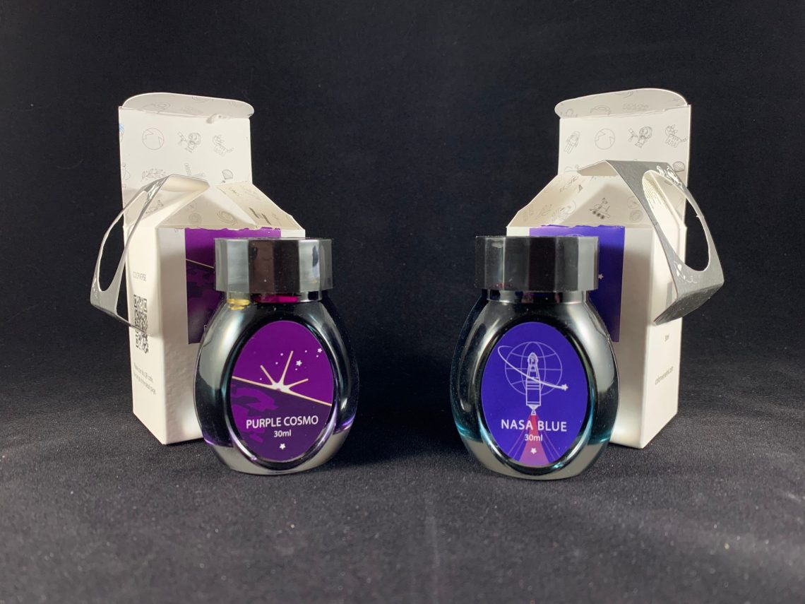


 Whatever the reason, I have one desk in my office currently designated for all things work, and one desk designated for all things ink. I typically use paintbrushes and glass pens for ink swabs. I consider the paintbrush the “gold standard” of swabbing an ink, but brushes require time and dedication to clean properly between each ink. The same is true of
  Playing with ink is meant to be fun and relaxing, so I’m not saying speed and efficiency should be prioritized. But when you have minimal time to take breaks, you find creative ways to maximize that time. That “creativity” had me wondering if there were other options I had not previously considered.
Spoiler alert: Massive rabbit hole ahead.
Playing with ink is meant to be fun and relaxing, so I’m not saying speed and efficiency should be prioritized. But when you have minimal time to take breaks, you find creative ways to maximize that time. That “creativity” had me wondering if there were other options I had not previously considered.
Spoiler alert: Massive rabbit hole ahead.
 It started rather simply. I found a
  The first goal was to find a suitable replacement for my newly beloved foam swabs. I tested the plastic square tool from the cake decorating set and the tiny metal makeup spatulas.
 I also tested the silicone brushes from the clay sculpting set and the tiny purple silicone spatulas.
Overall, all of the above tools get the ink onto the paper, but the end result varies a bit from tool to tool. Some show a little more shading than others or shading in a different part of the swab. The major difference between the paintbrush/foam swab and the rest of the tools comes when you are trying to make a straight line. Nothing really comes close to the clean lines of the swab or the brush.
I also tested the silicone brushes from the clay sculpting set and the tiny purple silicone spatulas.
Overall, all of the above tools get the ink onto the paper, but the end result varies a bit from tool to tool. Some show a little more shading than others or shading in a different part of the swab. The major difference between the paintbrush/foam swab and the rest of the tools comes when you are trying to make a straight line. Nothing really comes close to the clean lines of the swab or the brush.
 However, if you’re going for a more abstract approach, the re-useable tools produce results that are much closer to the brush or swab.
 The cake decorating and clay sculpting kits also came with tools with ball tips of various sizes.
 It takes a little bit of practice, but these tools produce lines similar-ish to what you might get from speedball nibs of various sizes. The main difference is that you need to re-dip the tool into the ink every 1-2 letters. The upside is that means they are a breeze to clean.
 The cake decorating set also came with some other wacky tools, and let’s just say I had some fun with these.
 Unfortunately, many of the pointy tools that look similar to the tip of a glass pen are not very useable with ink. The ink just doesn’t get transferred to the tip of the tool with enough consistency to produce any kind of normal writing.
However, several of the tools here were particularly fun when you applied ink to the page first and then used the tool to spread the ink across the page. This was especially fun when multiple inks were applied to the page at one time.
Unfortunately, many of the pointy tools that look similar to the tip of a glass pen are not very useable with ink. The ink just doesn’t get transferred to the tip of the tool with enough consistency to produce any kind of normal writing.
However, several of the tools here were particularly fun when you applied ink to the page first and then used the tool to spread the ink across the page. This was especially fun when multiple inks were applied to the page at one time.
 Out of all the tools I used, there are a few that stand out as the tools most likely to get regular use in my ink rotation.
 The silicone and metal spatulas are probably the most practical. They both suffer from the need to repeatedly re-dip into the ink, but they certainly get the job done. None of the tools replicate a paintbrush or the foam swab perfectly, but the
  The two tools that surprised me the most and produced the craziest results were two additional cake decorating tools. I used a pipette to put two different inks on the page and used the tool to drag the inks across each other. The results produced some gorgeous colors. The blue curved plastic tool actually produces some really nice character and variation in the lines it creates.
 I may not have found the perfect reusable solution yet to replace my foam swabs, but I definitely added several new unconventional tools to my ink desk.
I think I would call that a successful trip down a rabbit hole. Do you use any unconventional tools to test your inks?
I may not have found the perfect reusable solution yet to replace my foam swabs, but I definitely added several new unconventional tools to my ink desk.
I think I would call that a successful trip down a rabbit hole. Do you use any unconventional tools to test your inks?


